

Hello, I'm Nick. I design insane websites and user interfaces.
This is where I talk about all of the cool sites I find online.
Every AI product landing page is starting to look the same. Purple-to-cyan gradient hero. A neural net diagram somewhere in the middle. The word "intelligence" used four times. A "futuristic" font that nobody chose, the default fell out of an AI-themed template. The category has a uniform, and the uniform is bad.
Fourmula AI refused to wear it.
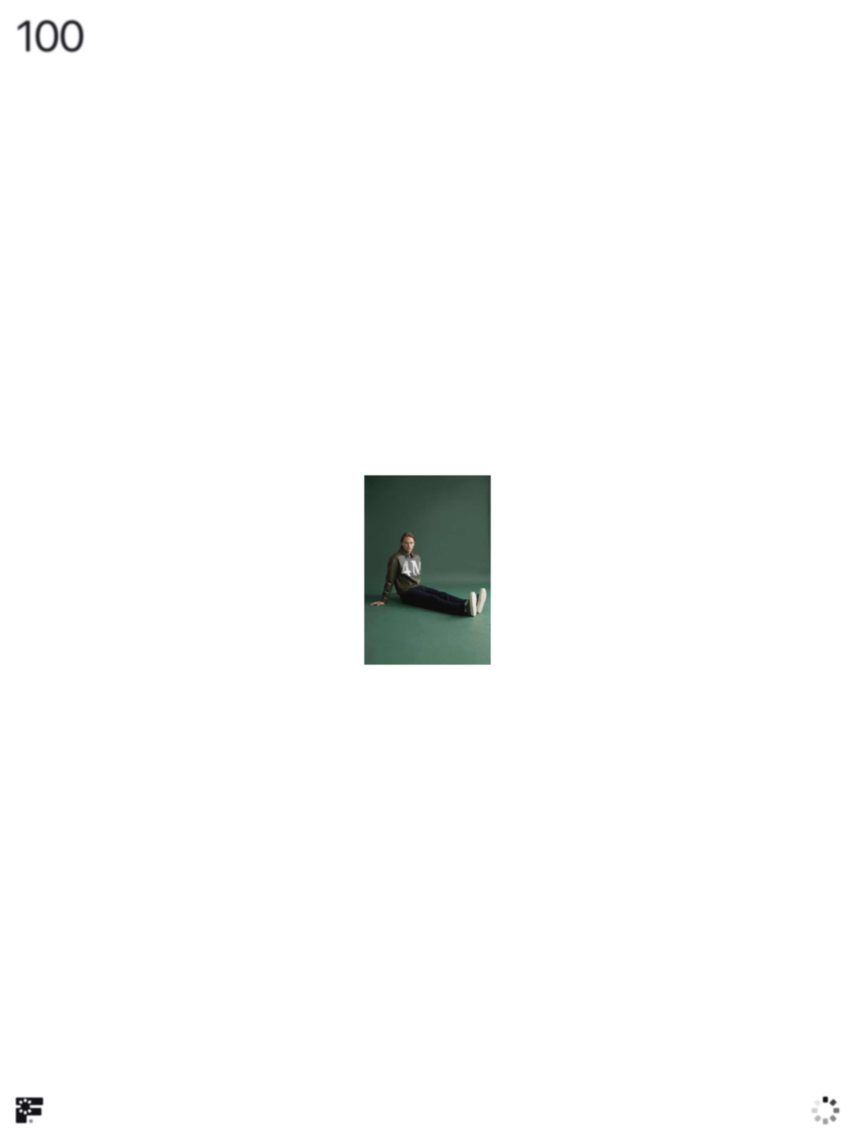
Fourmula sells generative photography to ecommerce brands. The product is, in fact, AI. The site looks nothing like AI software. It looks like an Apple product page. It looks like a fashion editorial. It looks like the landing page of the kind of DTC fashion brand that would be the customer. That last bit is the move.
Look like your customer's customer
The pitch behind Fourmula's design is that an ecommerce brand director landing on the site should instantly recognize the visual register. SF Pro Display at 88 to 120 pixels, weight 400, tight negative letter-spacing. Near-black background (#020108, not pure black, softer and a touch indigo). One warm orange accent at #FF6B02, used so sparingly you almost forget it's there. Full-bleed product video. Wide gutters. No icons. No illustration. No decorative chrome.
This is the visual language of premium ecommerce. Apple's PDP. The Row. SSENSE. Aimé Leon Dore. The brands that Fourmula is selling to are themselves using this register on their own homepages. When the buyer lands on Fourmula's site, the first thing they feel, before reading a word, is recognition. These people know what good looks like in my industry. That's a sales argument made entirely with type and spacing.
It's also a category disguise. By refusing to look like AI software, Fourmula avoids the tax that every AI product currently pays: a default visual register that signals "tech demo" before the buyer reads the value prop. The category default is so strong that just refusing it is half the work.
The discipline behind the look
Restraint is hard. The temptation on a long-scroll product page is to add. Add a hero illustration. Add a gradient. Add an animated AI orb. Add a custom cursor. Each addition feels like progress while you're working on it, and each addition pulls the page further from the editorial register it's trying to claim.
Fourmula's discipline shows up in specific numbers. One accent color, holding maybe five percent of the total visible surface. Two button states only, black-on-white and gray-on-black, no shadows, no gradients. Zero icons. Zero canvas elements, no WebGL. Hovers darken or underline, that's it. The site is 11,000-plus pixels of scroll and still feels quiet because nothing in it is asking for attention except the type.
The accent is the tell. Orange #FF6B02 shows up at exactly the moments where the page wants the eye to land. A key button. An accent word. A small chromatic heartbeat that says "this matters." Because it almost never appears, it earns attention every time it does. Most AI landing pages waste their accent budget on the gradient hero and have nothing left to spend on the actual conversion moment.
The honest tradeoff
Fourmula's accessibility score lags the rest of the site. 88-pixel display type and low-contrast secondary text serve the editorial mood at a real cost. Reduced-motion users get a degraded experience. Mobile is an afterthought, this is a desktop-aesthetic site assuming a 1700-pixel-plus viewport. The team made a bet that the buyers it's targeting are on big displays, scrolling on a Tuesday afternoon, and that the accessibility hit is worth the brand signal.
That's a real tradeoff, not a flaw. Worth naming. And worth thinking about for your own AI product. The bet only makes sense if you know exactly which buyer is converting on which device.
What to take with you
If you're shipping a landing page for an AI product, the first design decision is whether your buyer comes from a visually sophisticated category or not. If they do, default to your buyer's aesthetic, not your category's. Fashion DTC, premium hospitality, architecture, editorial publishing, luxury retail. Each of those has a recognizable visual register. Adopting it costs you nothing and earns you instant credibility with the only people you actually need to impress.
If your buyer comes from a category that doesn't have a strong visual identity (back-office SaaS, internal tools, developer infrastructure), the calculus changes. The fashion-AI move only works because there's a coherent register on the other side of the buy. Without that, you're just choosing arbitrary aesthetics.
Either way, the lesson holds. Stop letting your category decide what your AI product looks like. The buyer is not in your category. The buyer is in theirs.
Thinking about a homepage that doesn't read as generic AI?
If you're shipping an AI product and your current landing page leads with the gradient hero and the neural-net diagram, you're probably leaking trust with the exact buyer you want. A homepage that looks like the buyer's world, not your category's, is what we build at Crazy Creative. See what we've built at crazycreative.design.