

Hello, I'm Nick. I design insane websites and user interfaces.
This is where I talk about all of the cool sites I find online.
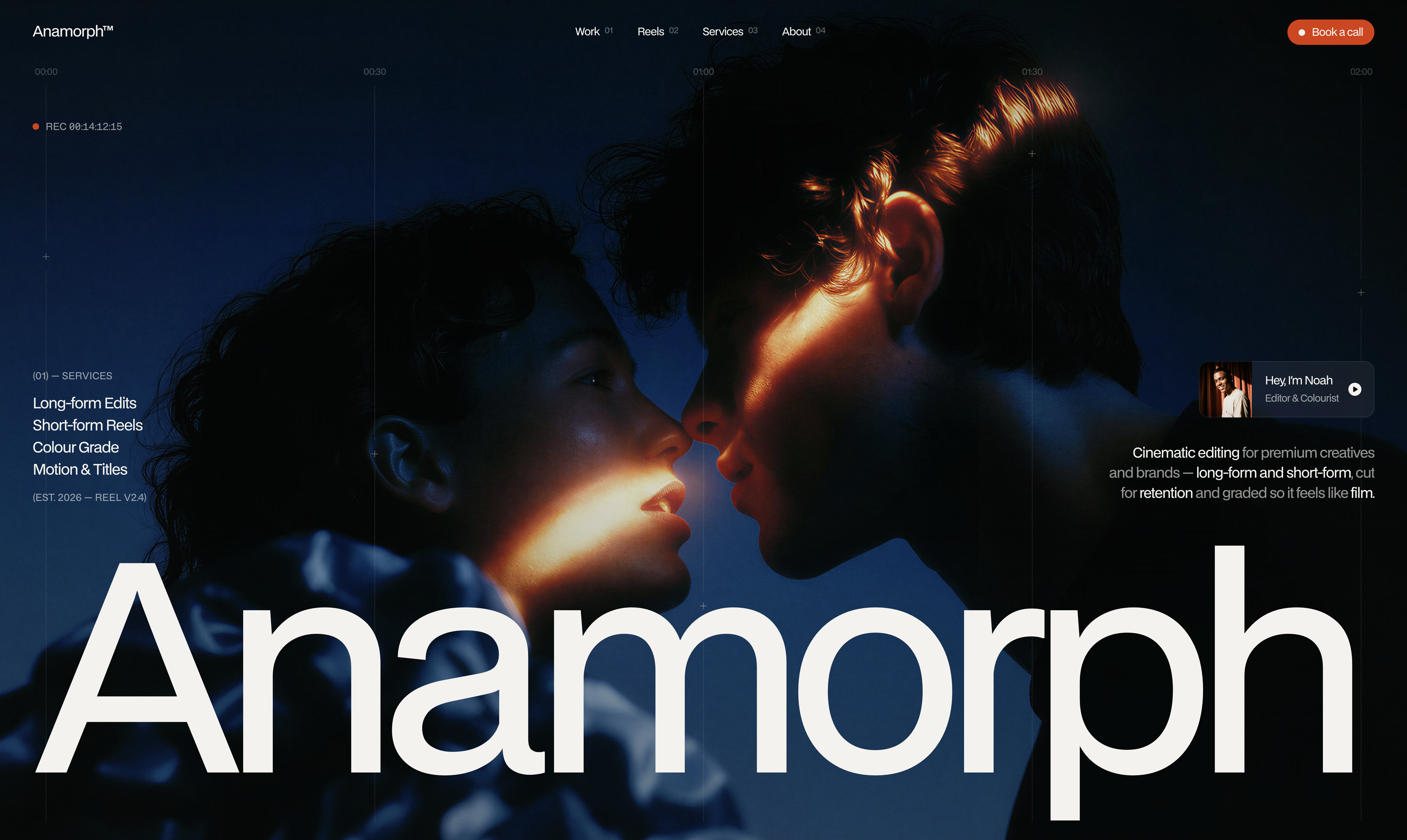
I've watched the first 2.4 seconds of Anamorph more times than I want to admit, and every time I catch something I didn't notice before. Which is the whole point of the thing. It is a colorist's portfolio whose cinematic portfolio load animation color-grades itself in front of you before the site says a single word.
Here is what actually happens in those seconds. At about 300 to 700 milliseconds after load, the hero video is present at full vivid saturation. Raw footage. Deep teal shadows, hard amber rim light on skin, the kind of contrast you would get straight off a camera before anyone touched it. There is almost no interface yet. Just the REC label in the corner.
Then two overlapping animations do the work. The element named Grade runs 2200ms with a 250ms delay. The element named Vignette runs 2400ms with a 450ms delay. Both on cubic-bezier(0.16, 1, 0.3, 1), an ease-out-expo with a long decelerating tail. Across those two-and-a-bit seconds, the hero visibly darkens, cools, and gains its corner falloff.
You are watching a grade being applied.
The first thing this colorist does on their portfolio is grade their own hero. Not a metaphor, not a reference, not a screenshot of a timeline pretending to be craft. An actual grade animation running on measured curves, executing the exact service the site is selling, in the first three seconds before you have even read what the company does.
Why the cinematic load animation takes so long
Nearly four seconds to fully settle. That is a long open by 2026 standards. Most sites treat the first paint as a race condition, chasing every millisecond of LCP they can shave. Anamorph does the opposite, on purpose.
The reason it earns the length: the thing taking the time is the argument. The Grade and Vignette animations are not ornaments running on top of the real content. They ARE the real content. If those animations resolved in 400ms you would never register that a grade was being applied. You would just see a hero video. The 2400ms duration is what makes the mechanic legible.
Underneath the grade, the interface staggers in on the same curve. Ruler ticks at Tick 00:00, Tick 01:00, Tick 02:00 each run 1500ms with delays of 650, 1150, and 1650ms. A clean 500ms stagger. Then a second family of 600ms elements arrives at 2150, 2650, and 3150ms, the same 500ms interval applied twice. Navigation arrives last of the chrome at 900ms with a 2000ms delay. Mid Row closes the sequence at 1400ms with a 2300ms delay.
The whole thing settles at roughly 3700ms. And every element that lands is riding the same cubic-bezier(0.16, 1, 0.3, 1) character. Durations vary, the curve never does. That is what makes a motion-heavy page feel authored rather than assembled.
The chrome that does the credentialing
The other move I keep studying is the section header system. Every content section on this page carries a header rule that looks like this: a left label with a section index and a name, a centered + registration crosshair, and a right-aligned timecode.
(01) — SELECTED WORK at the left. A + in the middle. 00:02:00:00 at the right.
Then the next section reads (03) — SHORT-FORM REELS / 00:03:00:00. Then (06) — RATES / 00:06:00:00. And the last section header reads END OF REEL — 00:08:00:00.
The whole page is scored as an eight-minute reel. The section indices are chapter markers. The timecodes advance. The metaphor is committed to at the level of a UI system, not a graphic flourish, and it pays itself off in the last ten pixels of type on the last section header.
You don't have to read any of it. You can miss all of it and still take away that the page feels like a piece of post-production without knowing why. That is what makes it work. The credentialing is happening in the chrome, not the copy. A timeline ruler running across the hero at 00:00 / 00:30 / 01:00 / 01:30 / 02:00. Small + registration crosshairs scattered at intervals through the field. A REC counter top-left. File-style captions on every media asset: ● meridian_master.mp4 · 00:04:12 on the left, 4K · 24 FPS on the right.
None of that is decoration. All of it is evidence of a working pipeline.
The neutral scale that isn't grey
This one is a technical detail and it is why the whole thing holds up under a magnifying glass.
There is no grey in this palette. Zero. The site runs on #0a0a0a near-black, #f4f2ed warm cream, and #db3903 orange as its accent. Every intermediate tone — every hairline, every secondary label, every fill on the barely-there logo cards, every alpha-boosted state on hover — is the cream #f4f2ed at a different alpha step. Twelve of them, from 80% down to 3%.
That single decision is why a nearly monochrome page still reads warm instead of cheap. And it pre-authorizes the hover system: the site's only authored CSS transition is color 0.3s ease-in-out, and the dominant hover is a step up the same alpha ladder. #f4f2ed66 to full #f4f2ed. No color shift, no scale, no shadow. In a palette like this, brightening on hover is already a legible state change.
I want to steal this so badly. Building a neutral scale out of your brand color at graduated alpha rather than reaching for grey is one of those decisions that costs nothing and does an enormous amount of quiet work.
The joke where the ego should be
The About section is the emotional center of the page and it delivers its punchline in the exact spot where a lesser portfolio would put a mission statement.
The layout: a two-tone statement headline across the top ("Every frame handled" in cream, "by the same person" at 60%), then a centered vertical column running an end-credits crawl that ghosts out at the top and bottom behind a soft mask. Role above name, repeating. SOUND / Noah Reyes. TITLES / Noah Reyes. MOTION / Noah Reyes. CATERING / Still Noah. EDIT / Noah Reyes.
The crawl runs upward continuously, and every cycle lands on CATERING — Still Noah as the joke. The motion IS the argument that one person did everything, and the humor is right where the ego should be.
Confidence to put a joke at the emotional center is itself the argument. Someone this relaxed has done this a lot.
The one thing I hope somebody fixes
The four fields in the booking form have zero focus state. Measured before and after focus, backgroundColor, border, outline, and boxShadow are all unchanged, and the native outline is suppressed. On a page this attentive to the appearance of precision, that is the one omission that actively costs a keyboard user, and it is the exact detail that separates a template from a shipped studio site.
Doesn't undo the rest of it. It is the sort of thing that would take fifteen minutes to fix and would move this from a genuinely great portfolio into an unassailable one.
What I'm taking with me
Three moves I have already lifted out of this and used somewhere else, and one I am still trying to figure out how to apply.
The alpha-ladder neutrals I started using immediately. It works everywhere the palette is warm.
The one-curve-many-durations discipline. Pick a single entrance easing and apply it universally, then vary duration and delay. It is what makes the motion feel like it was made by one person.
Captioning media like a file, not a photograph. ● filename · runtime on the left, format · frame rate on the right. Converts decoration into evidence.
The one I am still working on is the load sequence itself. The idea of running the service being sold as the load animation of the site is enormous. It doesn't have to be a color grade. Any portfolio whose product is a transformation could do this. A copywriter could load with a rough draft that revises itself over 2000ms. A brand designer could load with an unrefined mark that snaps into a finalized identity. A data viz shop could load with raw noise resolving into a legible chart.
Anamorph got there first and set the ceiling extremely high.
Want your site to argue for itself before it starts talking?
The best sites don't tell you what they do. They demonstrate it in the chrome, the load, the layout, the way the smallest details behave. Anamorph committed to that principle harder than most portfolios ever dare, and the whole document reads as one authored piece because of it.
That is the kind of conceptual rigor we build at Crazy Creative. Sites where the central metaphor is committed to at the level of the system, not the surface. See what the studio has been making at crazycreative.design.