

Hello, I'm Nick. I design insane websites and user interfaces.
This is where I talk about all of the cool sites I find online.
I expected another crypto landing page. Gradient mesh sky, glassmorphic stat cards, the word "trustless" used at least once. What I got instead was a masterclass in editorial web design.
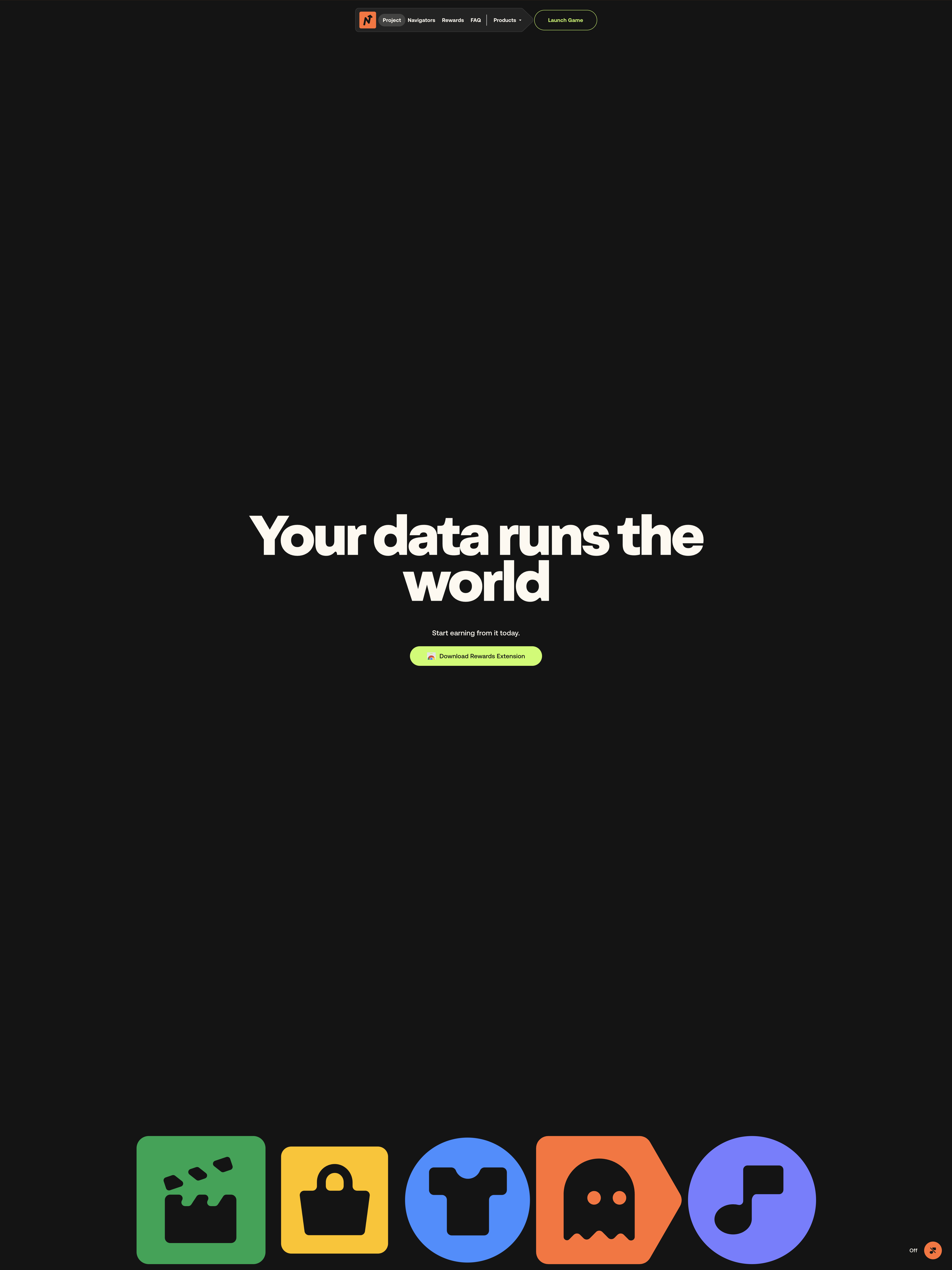
Navigate is a Web3 data platform. Its site is forty five thousand pixels of editorial prose. A single chapters section eats 31,248 of those pixels. Each manifesto paragraph appears twice in the DOM. Once as flowing copy you can read at speed. Once as a vertical stack of single words that light up one at a time as you scroll. A magazine designer got the assignment and refused to compromise.
The argument arc is the thing. Hook (you are the product). Evidence (your data is taken). Pivot (it's time for a change). Solution (Navigate). Op-ed structure for op-ed pacing. By the time the CTA shows up, the case has been made.
The editorial web design pattern at the macro scale
Most landing pages in this category run a familiar playbook. Hero with neon-on-black headline. Three feature cards. Customer logo bar. Founder bio. Pricing. The whole thing clocks in at maybe 6,000 pixels and asks you to convert in under a minute.
Navigate refuses every part of that. The page is 45,000 pixels tall. Lenis smoothing handles the inertia so the scroll feels weighted instead of jittery. A 31,248-pixel section called section-chapters is the spine of the page. Inside that section, the team commits to the magazine bit completely. Body copy in Aeonik, the calm narrator voice. Display copy in Oldschool Grotesk Heavy, the protagonist voice that has to land each headline as something you remember. Paragraphs duplicated for the word-stack reveal. Cream paper interludes at #fdf9f0 to give the eye a rest from the #141414 stage.
This is what editorial web design actually means when a team takes it seriously. Not a serif font dropped onto a SaaS layout. A commitment to the rhythm of reading. To column rhythm, type pairing, palette restraint, scroll choreography. To the idea that the page is a thing the visitor moves through. Scanning isn't on offer.
The Rive bet
Thirteen Rive state machines on first paint. That's not a metaphor. Every illustration on this site is a Rive canvas. So is the signup button. So is the docs button. So is the menu trigger. The class names give it away: btn-signup-rive, btn-docs-rive, btn-menu-rive. Hover, active, and loading states all authored in the Rive editor by the design team. The dev work is mounting a .riv file at a selector and listening for the state machine inputs.
I find this fascinating because of who it puts in charge of the motion language. Most product orgs split this. Designer makes a Figma file with arrows. Engineer translates the arrows into CSS transitions and JavaScript timelines. Some intent survives that handoff and some doesn't, but the negotiation happens either way.
Navigate skips the negotiation. Motion is design's deliverable, full stop. The button itself is owned by the design team. This is the kind of workflow decision that compounds over years. Faster iteration. Tighter motion identity. Less drift between mockup and ship.
The tradeoff is the payload. Rive runtimes aren't free, and thirteen canvases at first paint is meaningful weight. Mobile users on throttled connections will feel it. The team has clearly accepted that. Cloudflare beacon is in place, presumably tracking how far visitors scroll before they bail. The 45k-pixel page is a filter for committed readers, and the heavy first paint is the cover charge.
The color move
This is the part I keep thinking about. Acid lime #c7ff69 plus coral orange #ff6d38 on near-black #141414, with cream #fdf9f0 paper sections as rest stops. Three colors, used flat. No gradient between them. No mesh. No rainbow.
Acid lime is dangerous territory. It sits one wrong shade away from the neon green that has become the default crypto landing page accent. The kind of green that screams "another L1 token site" before you've read a single word. Navigate dodges it by pairing the lime with coral. Coral is warm. It belongs in magazines, not in Web3 vernacular. The combination signals "editorial publication that happens to be about crypto" instead of "crypto product that hired a designer."
Cream is the move that holds it together. Every few thousand pixels the stage inverts. Same dual-accent palette, but the background flips to cream. The eye gets a breath. The brain registers a chapter break. Then back to dark for the next argument beat. This is reading rhythm applied to a website. Most teams don't even know this is a tool available to them.
The honest part
Not everything works. The word-by-word reveal is the dominant motion on the page, and it repeats. Paragraph after paragraph. After the third or fourth instance of "watch the words appear one at a time" the device starts to feel like a hammer that's seen every nail. A longer page with one signature gesture needs that gesture to either escalate or get out of the way at some point. Navigate doesn't do either.
The hook also isn't new. "Today, you are the product" has been on every data-privacy pitch deck since 2014. Navigate's twist (gamified earning instead of just-don't-track-me) is novel and well-argued, but the opening line is a familiar one. Visitors who've heard it will need to push past it to reach the actual thesis.
And the footer character. Big WebP illustration of "the Navigator" persona, anchored at the bottom of the final CTA section. With the whole site committed to Rive everywhere, the static illustration sticks out. It's the one place where the motion philosophy doesn't show up. Either commit the character to Rive too, or use the static image somewhere less prominent. Right now it's a tell.
What I'd steal
If you're a designer reading this looking for the takeaways, here's what's portable.
Duplicate paragraphs in the DOM for scroll-linked word reveal. One flowing version for accessibility and copy-paste. One word-stacked version that opacity-fades as scroll progresses. The keyboard-friendly version is doing real work even if the visual version is the show.
Adopt Rive for buttons, not just illustrations. The moment your buttons become Rive canvases, your motion language collapses into one tool. Iteration speed goes up. Identity goes up.
Three flat colors on a dark stage, with one of them being cream. The cream is doing the rest-stop work that gradients usually do badly. It also keeps the whole palette from reading "Web3" or "SaaS" or anything else.
One long chapter section instead of five short ones. If you have an argument to build, build it. Don't chop it into bullet points pretending to be feature cards.
Editorial type pairing on a non-editorial product. Aeonik plus Oldschool Grotesk Heavy lifts a product page into a register most product pages can't reach. Other pairings work too. The principle is to pick a narrator voice and a protagonist voice, and let them work as a system.
Navigate is a Web3 data platform that built its homepage as a magazine. That's the headline. The deeper move is that the team trusted their visitors to read. In a category where most pages are designed for skimmers, that's the part worth copying.