

Hello, I'm Nick. I design insane websites and user interfaces.
This is where I talk about all of the cool sites I find online.
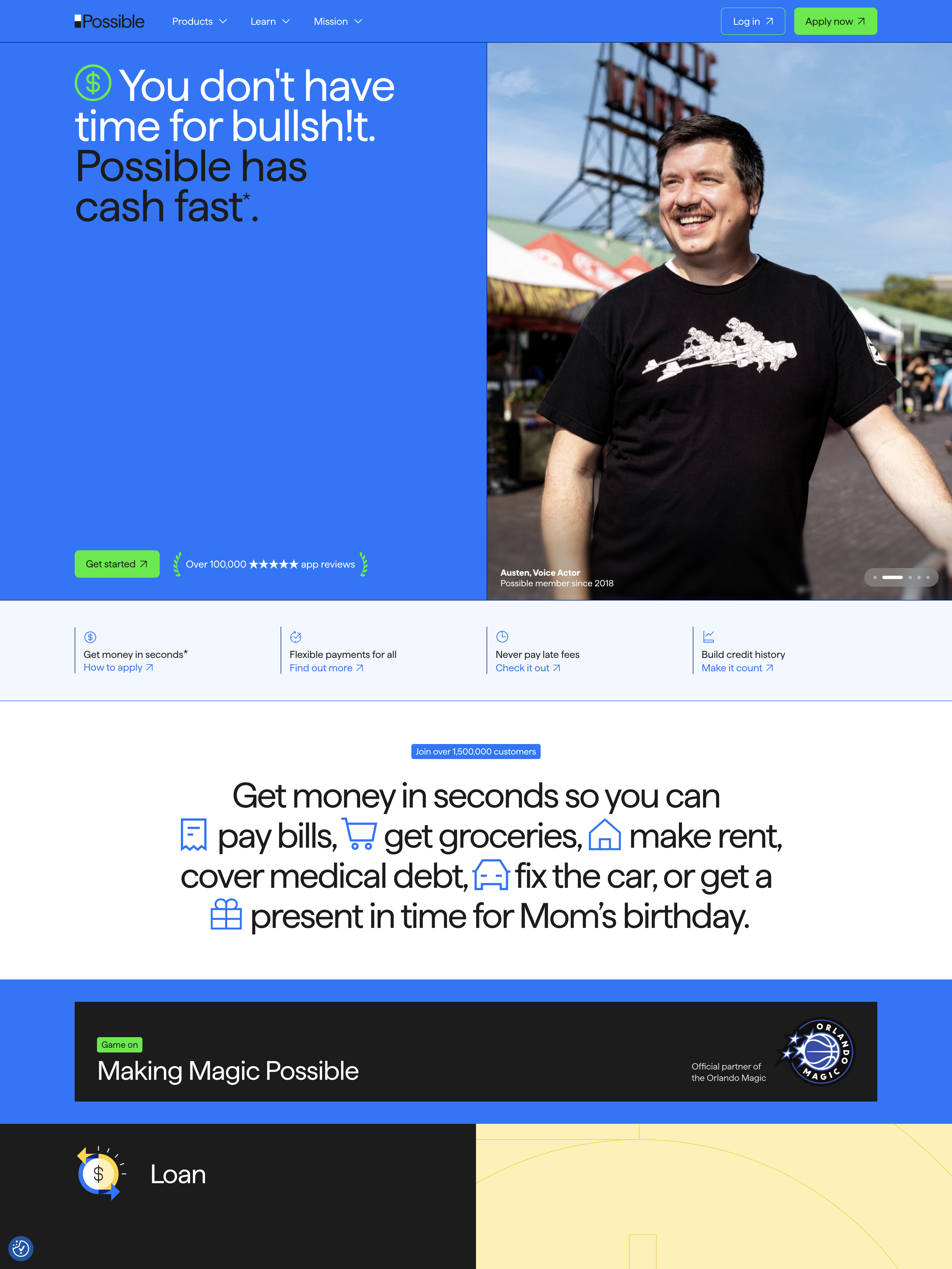
Possible Finance opens with a hero that swears at you. Eighty pixels of Haffer Regular set at 72px leading say "You don't have time for bullsh!t. Possible has cash fast." That single line tells you more about the team's intent than any brand deck ever could. It is what punk fintech design looks like when it actually works.
Source: https://www.possiblefinance.com/
The site is built in Framer, runs about fifteen thousand pixels tall, and uses a two-color brand pair so high-chroma it almost vibrates. Electric blue (#0577FF) for the sticky top nav. Electric green (#00EC25) for every primary CTA. There is no muted middle ground. CTAs are loud because the brand is loud, and the brand is loud because the category has earned a public middle finger.
The blue you weren't supposed to use
Look closely at the card text and you'll spot something almost everyone has scrubbed from production design since 2008: default browser link blue, #0000EE. Possible uses it as body text inside white cards and as the label color on green CTA pills. It's the color browsers render when nobody styles an anchor tag.
Most fintech brands replace it with a tasteful charcoal or a desaturated brand neutral. Possible kept the raw default. That single decision does two jobs at once. It saves the team a brand-token argument they never wanted to have. And it produces a recognizable signature that telegraphs "we kept the web's defaults" the same way a band keeps the studio amp hiss in the final mix.
It also happens to be the color Framer's editor ships with for plain hyperlinks. Whether the team made it a values move or a "we'll fix it later that became forever," the result is the same. A brand color that looks like an accident and reads as conviction.
Haffer Regular at 80px is the whole identity
The hero headline is set in Haffer Regular at 80 pixels with 72px line-height. Negative leading. Display weight is not used anywhere on the page. Regular at display size is a quieter choice than the obvious Bold or Display cut, and it gives the typography a flat, declarative cadence. The letters don't shout. The words do.
Underneath the H1, Possible runs Inter Tight for nav and body, Fragment Mono for the dense regulatory ribbons in the footer. Three families, each doing one job. The system has no thirty-page documentation because it doesn't need one.
The odometer is the biggest motion moment
Possible's most kinetic element on the page is not a product demo. It is a multi-digit odometer rolling 0 through 9 in vertical columns until the digits settle on the dollar figure saved from "predatory junk fees." That's it. No parallax, no scrolljacked storytelling, no WebGL hero, no custom cursor.
The team picked one moment to spend motion on, and they spent it on the moral claim. Animation equals emphasis here, and what gets emphasized is the math of the mission rather than the speed of the product. Most landing pages waste their motion budget on the hero image. Possible saved it for the line that matters.
Cards do almost all the heavy lifting
Every product block, every testimonial, every nav dropdown is the same component. A white-or-light-gray rounded rectangle with a 32px Haffer hed, a one-line description, and a default-blue text link. The Loan block, the Advance block, the new Bill & Rent feature, the Orlando Magic co-brand callout, the testimonial wall, the latest content shelf. All cards.
This is honest modular thinking. It also has a cost. By the fifteenth section, the eye stops differentiating because the container is always the same. The site reads as a tidy product catalog rather than a paced mission document. That tradeoff is the price of shipping fast in Framer and treating the design system as a vehicle for voice rather than visual variety.
First name, occupation, member since
The testimonial schema across the site uses exactly three fields. First name. Occupation. Member-since year. Keisha, Office Manager, Member since 2023. Gloria, Member since 2022. Kristopher. Dakkota. No surnames. No corporate titles longer than two words. No stock photography. The portraits are circular crops of what look like real people.
Whether they actually are real customers or are staged, the schema treats them like a community rather than a marketing list. That three-field pattern is small. It is also why the testimonial wall reads as people instead of pull-quotes.
Voice is the design system
Strip the swearing out of the hero and the rest of the page reads as competent fintech. Strip the high-chroma blue-and-green pair and the voice has nothing to lean on. Strip the trust signals (one hundred fifty thousand five-star reviews, BBB A+, Orlando Magic partnership, NMLS license in the footer) and the swearing reads as posturing.
The team understood that profanity in a fintech hero is a load-bearing wall that only holds because the supports around it are equally aggressive. The marquee that repeats "More than 150,000 ★★★★★ reviews, 4.4 Google Play, 4.8 App Store, 4.5 Trustpilot, A+ BBB" four times across the screen exists specifically to underwrite the word "bullsh!t" eight viewport-heights above it.
What's underneath the punk
Pop the hood and the marketing tag stack is bigger than the visual system. LogRocket session replay watching every visitor. Google Tag Manager. Multiple GA4 streams. LinkedIn Insight. Ahrefs. FeedMob. Mountain.com attribution. CookieYes consent management. The site is a customer-acquisition instrument wearing a t-shirt that says "we're the good guys."
That tension between "your financial wellbeing is our responsibility" copy and session-replay tracking is real and unaddressed anywhere on the page. It is worth naming because it is also the most honest thing about the design budget. The visible polish is Framer-default. The invisible engineering went into the funnel.
What punk fintech design teaches the rest of us
When your category has a trust problem, breaking tone in the first six words can do more work than any visual flourish. The condition is that you bracket the break with trust signals louder than the break itself. Stars. Reviews. Partnerships. Licenses. A public benefit corp registration. Stack the proofs and the swearing becomes positioning. Skip the proofs and the swearing becomes a tantrum.
Possible Finance stacked them. The site isn't beautiful, and it doesn't try to be. It is a single-scroll mission document built fast in Framer, in service of a brand that understood voice is cheaper than custom illustration and louder than any hero render.
Spend on the words. Stack the proofs. Save your motion budget for the line that matters.