

Hello, I'm Nick. I design insane websites and user interfaces.
This is where I talk about all of the cool sites I find online.
Most "longform" on the internet is a Google Doc dressed in a content shell. You scroll, you skim, you bounce. Then there is what Vogue Business and Archrival shipped with Gen Z Broke The Funnel Part II, a 6,000-word research report that behaves like a magazine spread, performs its own thesis, and politely refuses to be skim-bait.
I cannot stop thinking about it, so I tore it apart. Editorial scrollytelling design is having a moment, and this piece is the cleanest argument for the discipline I have seen this year.
The thesis is the form
The argument of the piece is that Gen Z is exhausted by frictionless commerce and hungry for intentional micro-friction. The microsite itself has friction baked into every chapter. Long scroll. Color-shifted spreads that mentally re-orient you. Statistic modules that count up from zero and demand you sit with them. The article wants you to slow down, and the design makes you slow down. You read about intentional micro-friction inside a piece of design that practices it.
This is the move I keep flagging in the studio. When the form is the proof of the argument, the argument lands harder than the prose alone can carry it. You can debate whether anyone outside the industry reads 6,000 words anymore. I would say the people this piece is written for absolutely do, and that is precisely the bet the team made.
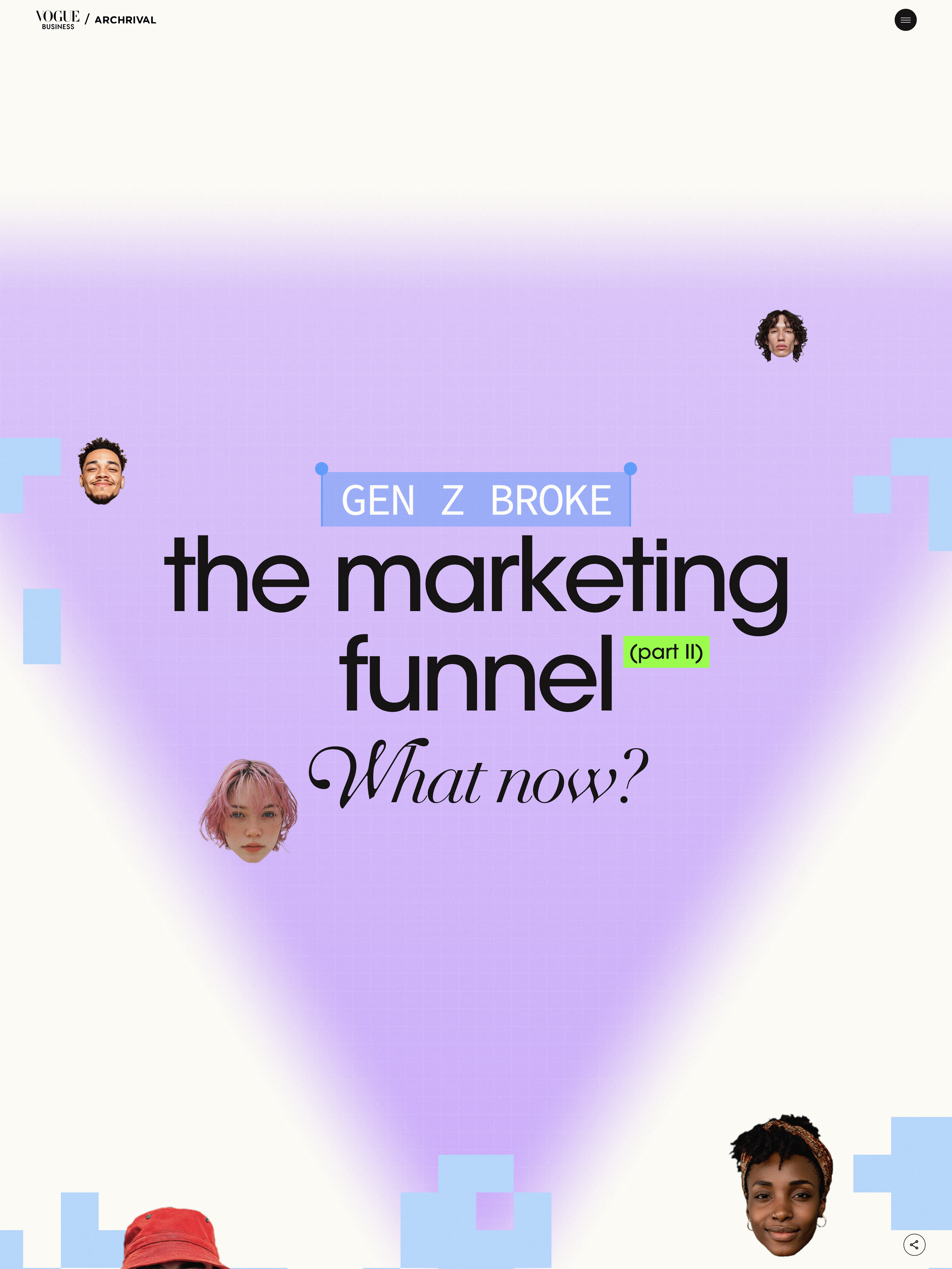
The hero opens like a magazine cover
The piece begins with an anchor menu (chapters listed as a table of contents) followed by an oversized stacked-typography hero: "GEN Z BROKE / the marketing / funnel / (part II) / What now?" mixing all-caps grotesk with italic serif. Underneath sits the senior trends editor's byline alongside the Archrival co-author credit. The visual register reads as authored journalism with a research backbone, which is exactly the credibility posture the piece needs to land.
Compare this to the standard Vogue article template, where you get a stock hero image, a headline, and a deck. The custom hero alone tells the reader they are about to spend more time than usual, and that the time is going to be worth it.
Display type doing structural work
Each chapter opens with a typographic event so loud you know the argument before the prose starts. Italic serif stacked next to all-caps grotesk. Word-doubling ("doomshopping / doomshopping") for stutter emphasis. Glitch substitutions ("Meh~" sliding into "Shopping isn't fun anymore"). These are not decorations sitting above the body copy. They are the section openers, doing the work that a magazine spread does when you turn the page.
The move I want to steal: mixed italic serif and all-caps grotesk in stacked display headlines. Italic serif carries voice. All-caps grotesk carries weight. Together they read as editorial without tipping into stuffy. It is the kind of typographic decision that takes a brave art director, because the safer choice is to pick one face and ride it. The braver choice gives every chapter a personality and still feels like one publication.
Chapter color blocks instead of UI chrome
The page is mentally segmented into something like ten chapters, each with its own background tone. You feel location through color. There is no progress bar yelling at you. There is no chapter-of-ten counter pinned to the corner. The wayfinding is doing its job invisibly, the way a good magazine does it with paper stock and section dividers.
This is a pattern more sites should steal. Long scroll pages keep adding navigation chrome to apologize for being long. The chrome itself becomes noise. A color shift across spreads is quieter wayfinding, and quieter wayfinding lets the content stay the center of attention.
Data as paragraphs, not sidebars
Every statistic on the page is set as a full sentence in display type first. "87% of Gen Zs agree, most people buy more than they really need." The bar chart underneath is supporting evidence, not the headline. Then the percentages count up from zero as you scroll into the module, and you read seven of these modules over the course of the piece, all built off the same component pattern. Paired Gen Z and Millennial bars, identical typography, identical reveal behavior.
That is the second move I want to steal: one signature data-viz component, repeated. Build it well, drop it seven times. New chart styles every section would have diluted the rigor. Repetition with strong execution reads as confident research, not as a designer running out of ideas.
Restrained motion vocabulary
This is the part I admire most. The motion language on this page is roughly four moves total. Typographic substitution on chapter entry. Percentage counter-up on data modules. Fade-in on pull quotes. Minor reveal-on-enter for stat blocks. Nothing else. No parallax. No cursor wobble. No ambient drift. No hover hijacking. Every animation either marks a chapter break or animates evidence.
A site can feel high-craft with a motion vocabulary that small. The instinct to add ambient motion is almost always wrong. Most homepages I tear down have at least three animations doing nothing except reminding you that animation exists. The Vogue piece reserves its motion budget for moments that change minds. That is what discipline looks like in motion design.
Named voices as recurring characters
Throughout the piece, Gen Z subjects appear with full name, age, and city. Isabelle Inthisone in Chicago with her blue Longchamp bag. Akeem Muller, 23, NYC. These are not anonymous data points. They are characters who return across chapters and humanize the research findings. The pull-quote component that carries them has consistent typography across the whole piece, so they read as a recurring cast rather than scattered testimonials.
If you are doing research-led content, this is the discipline you need. Aggregate statistics convince the part of the reader who already wanted to believe you. Named human voices convince everyone else. The cadence (analyst voice, then human voice, then back to analyst) is the same cadence great podcasts use. The piece feels like reading, but it carries the rhythm of audio storytelling.
Authority by cadence, not by adjective
The piece never tells you it is rigorous. It demonstrates rigor through cadence: citation, named source, percentage, quoted analyst, another named source, another percentage. McKinsey gets cited. Bank of America gets cited. The Archrival study (1,000 respondents) gets cited. None of it feels like padding because the design treats every credential with the same restraint. There are no badges, no shouty banners, no "as seen in" logo wall. The seriousness lives in the typesetting.
A lesson worth tattooing on every marketing team: if you have to use the word "trusted" to convey trust, you have already lost. Show the receipts. Set them in real editorial type. Let the reader assign credibility on their own.
The honest tradeoff
The kinetic display typography is gorgeous on a desktop in daylight. It is more complicated on a screen reader. Repeated word treatments like "doomshopping / doomshopping" read out twice in audio. Glitch substitutions can produce confusing reading orders. I have no idea what their ARIA story is, and I would bet it is the area where craft compromised inclusivity. Worth flagging because every team that wants to copy this move will hit the same tension. The answer is to figure out the ARIA before you ship the typography, not after.
The last word is typographic
The piece does not end on a CTA. It ends on three words, stacked, in display type. Future. Meaning. Discovery. Then a back-to-top link and a credit line. That is it. No newsletter capture. No "want more like this" upsell. The editorial register holds all the way out the door.
That kind of ending takes confidence. Most long pieces end by trying to convert the reader into a subscriber, a customer, a lead. This one ends by leaving you inside the argument it just built. The conversion happens on its own, somewhere downstream, because the reader spent twenty minutes inside a carefully made thing and now associates that level of thought with this publication.
Want a site that performs its own thesis?
Most longform research dies on the page because the design has no opinion about the content. Vogue Business and Archrival proved that bespoke editorial design can carry a 6,000-word report into territory normal templates cannot reach. At Crazy Creative, we build sites where the form is the argument, where motion is reserved for moments that earn it, and where typography is doing structural work rather than decoration. If you have research, a thesis, or a flagship piece of thinking that deserves more than a content shell, the studio lives at crazycreative.design.