

Hello, I'm Nick. I design insane websites and user interfaces.
This is where I talk about all of the cool sites I find online.
Doooing is a Belgian interactive studio site that used to be a motion design studio. The site is their argument for why they made the change, and they had the nerve to make the argument by building a homepage that refuses to move until you touch it.
That is the whole reason it is in my folder. Doooing opens with a full-screen rainbow gradient curtain for about four seconds while the page assembles behind it. Then the curtain lifts. And the page just sits there. There is no entrance cascade, no fade-in stagger, no hero video playing at you. Nothing loops, nothing breathes. A single small folded object sits at the optical center of a nearly empty cream field, and the composition waits.
The first movement on this page is the one you cause.
Why an interactive studio site should refuse to move first
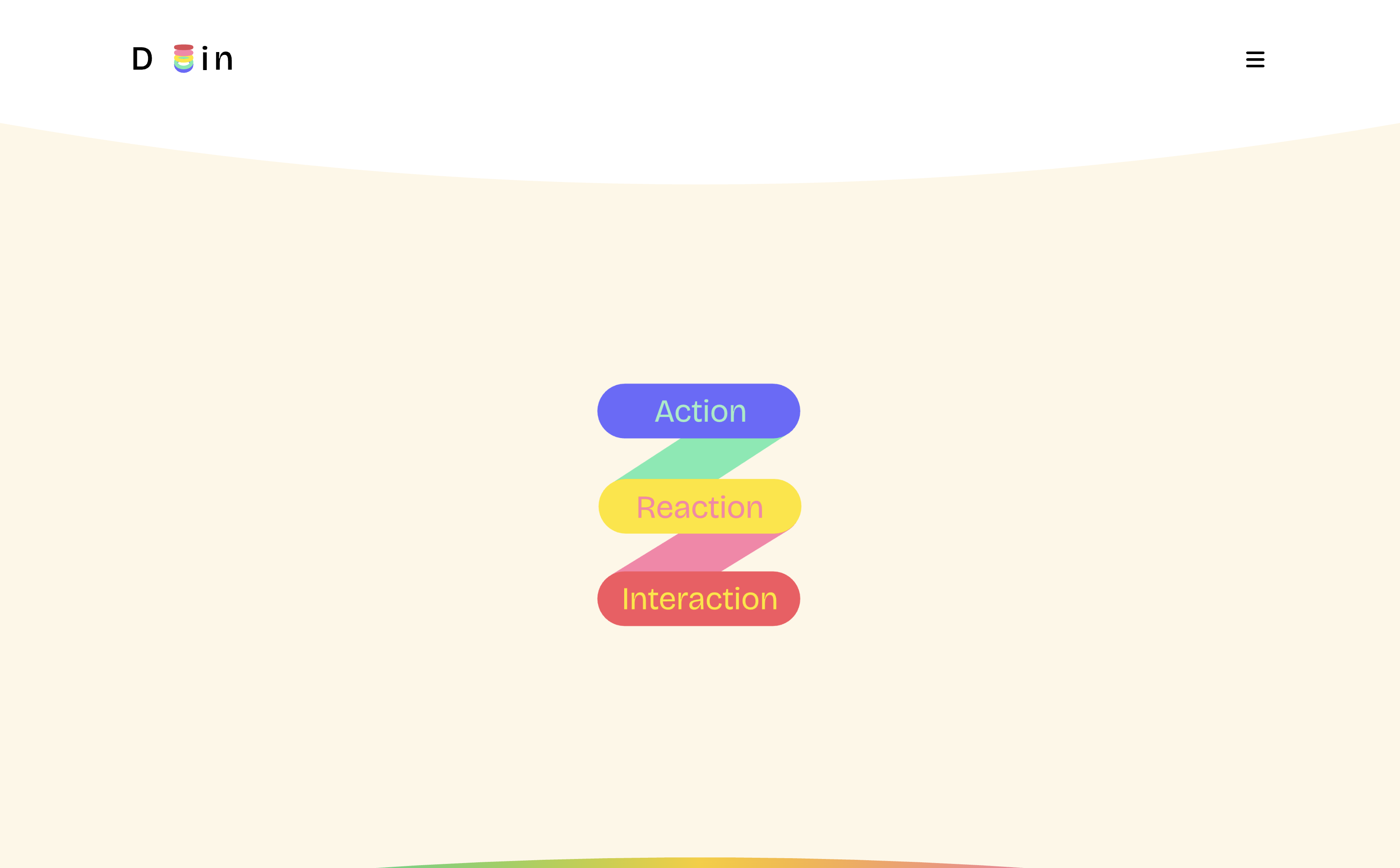
The resting hero is roughly 90% empty cream with one cluster at the center. Three stadium pills stacked in a Z shape, joined by two diagonal parallelogram bands. Periwinkle #6A6AFE with mint text, yellow with pink text, coral-red with yellow text. No headline. No CTA. No subhead. No eyebrow. Nothing above the fold explaining what this company does.
That absence is the section's defining nerve. Every convention says a hero must state its value proposition. Doooing skipped all of them. The composition is designed to read as potential energy, and you understand without being told that you are meant to finish it.
Move the cursor into the center and the pill stack unfolds like a carpenter's rule. Action rotates roughly -25° and swings right. Reaction pivots to about +55° with its label rotating bodily with it. The mint and pink connector bands stretch and articulate. The pills settle spread wide across the frame, and in the space they have vacated a full character scene assembles: a coiled red ribbon doodle, a large gradient sphere with two black-oval eyes and a crescent bite taken out of it, a periwinkle caterpillar of overlapping circles stitched with yellow dashes, an orange four-petal clover, a pink six-petal asterisk.
That is a lot of visual information arriving because you moved your mouse an inch.
The cursor as continuous input
The other detail I keep studying: the cursor is treated as a continuous input into scene state rather than as a binary hover trigger.
Across a 1040px horizontal pointer sweep, scene landmarks displace in measurable amounts. Orange clover +41px. Pink asterisk +27px. Gradient sphere +22px. Caterpillar +18px. Meanwhile the red ribbon moves -24px and the Reaction pill moves -18px, in opposition to the pointer. That is a range of roughly 1.5% to 4% of pointer travel, with several layers deliberately moving against the cursor to manufacture depth without any parallax translation.
The sphere's pupils track you on a shallower rig. The eye lozenge shifts with them, but the amplitude is under-damped on purpose. The character notices you without staring.
There is a whole separate 600×350 canvas devoted to a seven-circle chromatic worm that trails your cursor with per-segment lag, so the body curves behind the head and the whole chain whips when you change direction. A studio that reserves a dedicated Rive scene for a mouse-following worm has thought carefully about what a cursor should feel like.
Monochrome as semantic state
The move that clinched it for me is in the section immediately below the hero.
It is a full-bleed periwinkle plate carrying one oversized toggle switch labeled "Switch to / Passive." The toggle is deliberately painted periwinkle-on-periwinkle: the track is a shade darker than the ground, the knob is a shade lighter, the type sits at near-zero contrast. In the resting state the entire widget hovers at the edge of legibility.
Click it once and it detonates. Track drops to a navy recess. Knob becomes a mint-to-yellow-to-pink gradient sphere with a thick white collar ring and a soft white glow behind it. "Switch to" ignites to white with a visible bloom. A pink thumbs-up hand emerges from the track's left interior. An orange coiled ribbon blooms behind. Sparkles arrive under motion blur. The entire section inverts from monochrome dormancy into the full brand palette across about 2.5 seconds.
Low contrast, in this system, is not a restraint decision. It is a semantic state. Dormant. Color is what you unlock by acting. Once you understand that, the whole page reorganizes: the site's brand palette is not a surface you are being shown, it is a reward the visitor causes.
That is the studio's own repositioning statement rendered as a form control. "Moving from a passive medium to an interactive one," in their own About-page words. The switch is autobiography. I don't think I have seen a rebrand argument delivered this economically.
The clash rule holding it all together
Underneath the theatrics is a very specific rule I want to lift out.
Border color never equals text color. Colored surfaces never carry neutral text. The hero pills run mint on periwinkle, pink on yellow, yellow on coral. The nav overlay stacks five outlined pills whose five border colors are each deliberately mismatched against five different text colors. Even a two-word "Eat!" speech bubble down in the "Learning through play" section obeys it: mint type inside a periwinkle bubble on a pink flower's face.
Five hues combined by strict mismatch. The system reads as exuberant improvisation and is nothing of the kind. It is a rule with an exception list, one traveling gradient outline reserved for completed states, and everything else follows the disagreement.
Recreations that put white text on a colored pill produce something that looks similar and reads generic. The clash is what makes the palette feel authored.
What I keep taking away
The site is not perfect. The four content bands after the toggle settle into a rhythm that gets predictable by the fourth beat. The awards row overflows the viewport at 1440px and clips the first and last labels. There is no prefers-reduced-motion block anywhere on a page with twenty Rive canvases. The English page ships a French copyright line. The site could use another editing pass at the seams.
The refusal at the top of the page is the whole reason I keep coming back. Design the resting state as an invitation. Let the preloader be the entrance. Reserve drama for the interactions the visitor asked for. Give scroll one uniform reveal and nothing more, so the cursor and the click can carry the whole motion budget.
A studio moving from motion design to interactivity had to prove the difference is real. The clearest way to do that was to make a homepage that behaves like a room, not a performance. Doooing did.
Want a homepage that behaves like a room?
Sites that wait for the visitor read as confident. Sites that perform at them read as anxious. Doooing understood which side of that line they wanted to be on and defended it through every downstream decision.
That is the kind of restraint we design toward at Crazy Creative. Homepages that hold a resting state with real nerve, then reward the visitor with something disproportionate the moment they lean in. Browse the studio at crazycreative.design.