

Hello, I'm Nick. I design insane websites and user interfaces.
This is where I talk about all of the cool sites I find online.
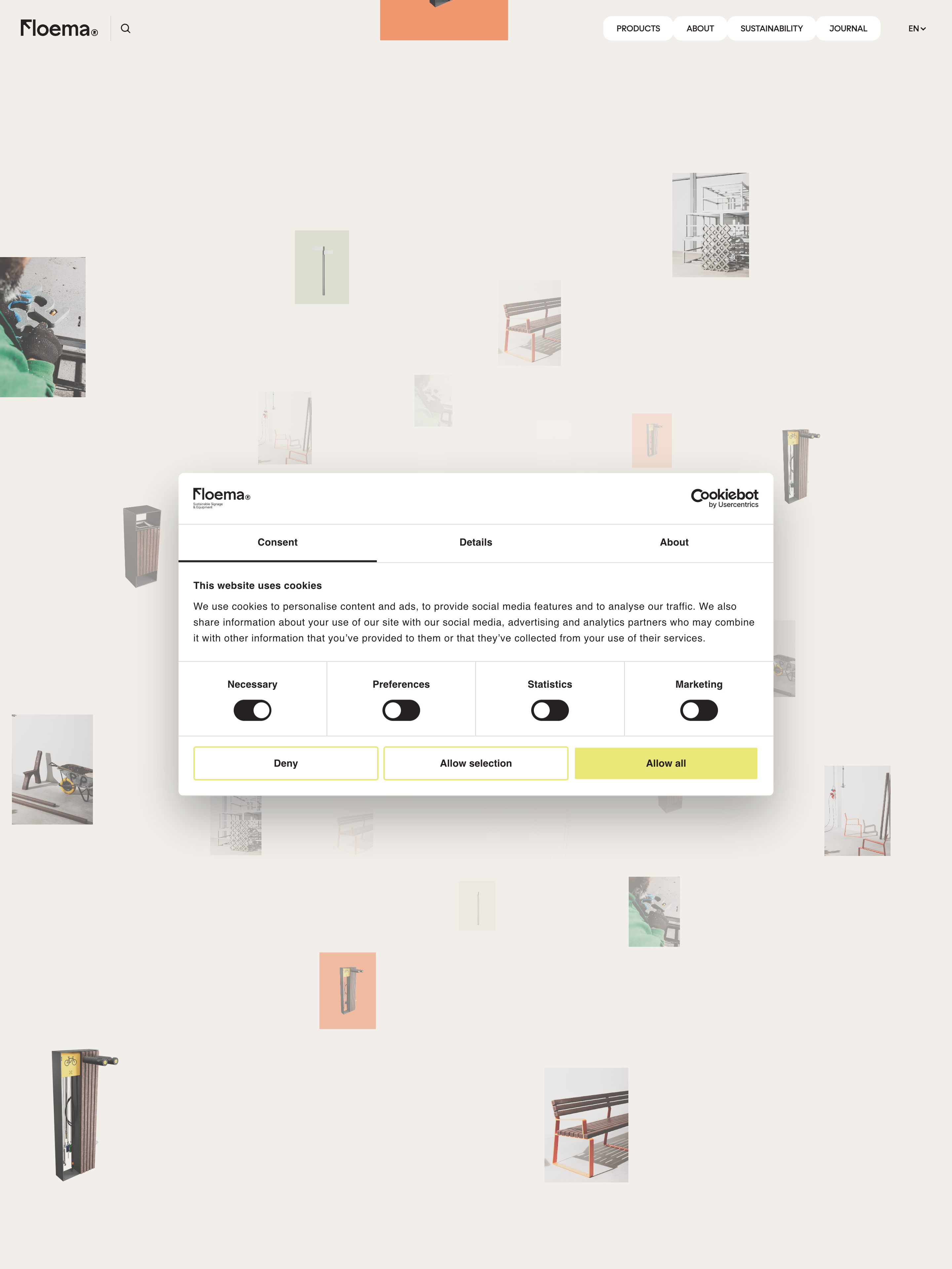
I keep coming back to Floema because of a specific feeling I cannot reproduce by describing it. The site behaves like a printed object. It has weight. It settles when you stop scrolling. Even the pixels on your screen feel like they have been printed on uncoated paper. It is the cleanest example of editorial web design monolith thinking I have looked at this year.
Floema is a Portuguese maker of urban, nature, golf, and recyclable-plastic signage and furniture. The site was designed by Büro. What Büro built for them is not a storefront. It is a single ~9000px vertical page that reads like a magazine spread you keep unfolding. There are almost no seams between sections. There is only rhythm.
What the mood is made of
Cream paper background at #F2EFEA. Warm near-black ink at #241F21. No accent color in the brand layer. Not blue, not green, not a highlight yellow. If chromatic energy appears on the page, it is coming from a product photograph or a WebGL vignette. The chrome of the site itself refuses to interrupt.
One typeface does the entire job. It is called Zimula, and it is a custom variable font with two axes: cnct for condensation and wght for weight. Display type runs at 56–64px at weight 400 with letter-spacing tightened to about −0.04em, so a four-word sentence becomes a graphic block that carries the whole viewport. Micro-labels drop to 12px at weight 600 uppercase, letter-spaced to −0.02em, with a top: -0.5px optical nudge so they align to the baseline the eye actually wants. Body copy sits at 15–16px with generous leading. That is the entire typographic system.
Motion is Lenis smooth scroll owning the whole page, with cubic-bezier(0.19, 1, 0.22, 1) at 0.5s as the house ease. That curve is easeOutExpo. It arrives. It does not bounce. Every button hover, every reveal, every state change uses the same curve. When a site respects a single motion signature that consistently, the page starts to feel like a material.
The WebGL is the piece I love most. There are three canvases inline on the home page, at retina resolution (3456px wide), and they are not particle fields or exploding meshes. They are still lifes. Quiet 3D vignettes placed like editorial photography. WebGL used to slow you down instead of speeding you up.
What Floema refused
Product-grid fatigue. If Floema wanted to be a normal maker-brand site, it would have led with a photo grid, a "Shop" nav item, and a set of category tiles. Instead, the home is a monolith. Nav has four items (Products, About, Sustainability, Journal). The catalogue reads as documentation instead of merchandising. Categories are labeled 01 Urban, 01 Nature, 01 Golf, with parenthetical counts like (50) next to them. The site labels places, then quantities, then products. In that order.
That is not the shape of a site optimized for conversion velocity. It is the shape of a site optimized for the reader's willingness to slow down. Büro made a bet that Floema's audience has time, and the site rewards them for taking it.
The pill button I keep studying
I want to call out one component in isolation because it teaches a small lesson. The Floema pill button has a 12px border-radius, about 12px vertical padding, and an animated background layer that crossfades on hover. There is no scale change. There is no bounce. The label color crossfades against the background layer using the same easeOutExpo curve at the same 0.5s duration as everything else on the page. It is driven by CSS custom properties named --btn-background-color, --btn-color, --duration, --ease, all defined in scoped Vue component styles.
Every design token in the component is a named variable. The whole button is authored as parameters, and the parameters happen to match the site's larger motion signature exactly. That is the level of alignment between design tokens and code architecture that most teams talk about and few actually ship.
What I'm taking with me
The lesson is that motion signature is a material property. If every state transition in a site uses the same 0.5s easeOutExpo curve, the whole thing starts to feel like one physical object. If the curves vary, it feels like a UI. That distinction is invisible on paper and immediate in the body. I have been thinking about it since I first opened this tab.
The other thing I am taking is the confidence to build one long page. The modern web has spent a decade slicing pages into components that scale independently. Floema goes the other way, and it works because every choice on the page respects the rhythm of the choices next to it. That is not a component library decision. It is an art direction decision.
Building a site that has to feel like a physical object?
If your brand makes something that is meant to last, and the current site does not carry the same weight, that is what we do at Crazy Creative. We treat the motion signature, the palette, and the type system as one material and design the page as an object rather than a template. Browse the studio at crazycreative.design.