

Hello, I'm Nick. I design insane websites and user interfaces.
This is where I talk about all of the cool sites I find online.
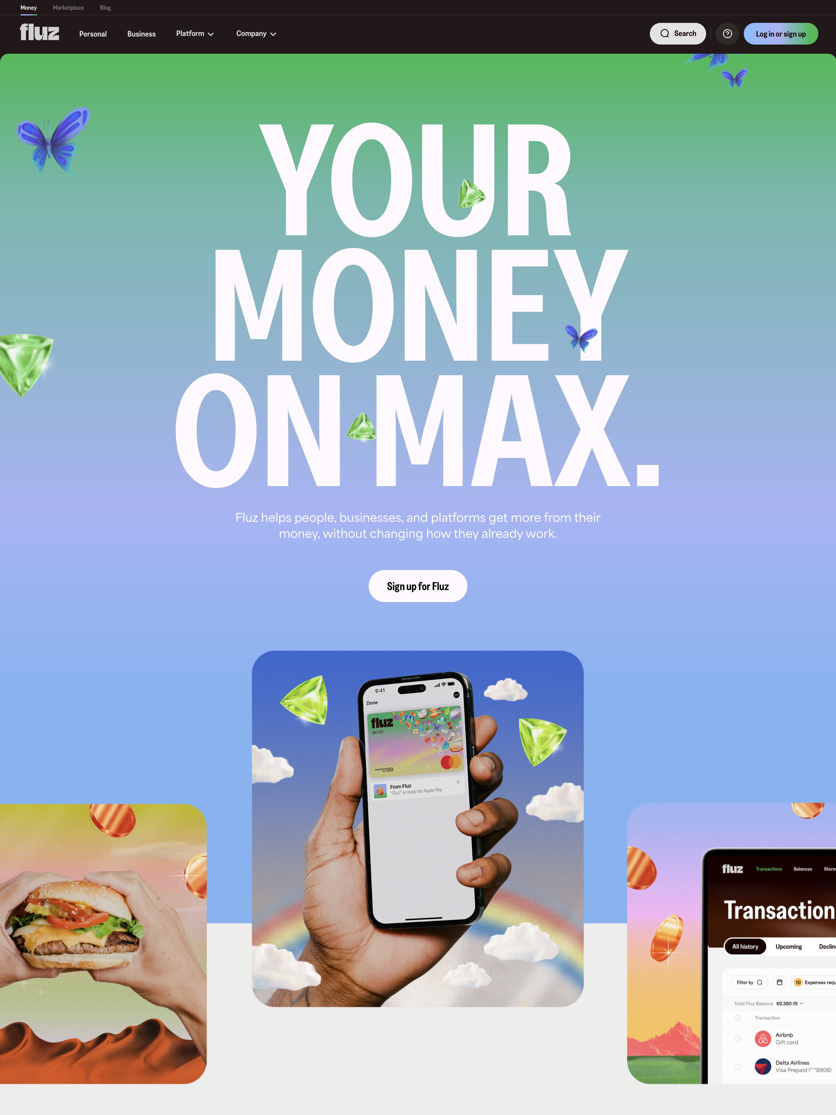
Open fluz.app/us and you'll see a 246-pixel typographic stunt — "YOUR / MONEY / ON MAX." — sitting on a warm cream stage. Then you'll view source and discover something strange: this fintech is on WordPress. In 2026. With Visual Composer. And jQuery.
This Fluz website review is partly about what that decision says, and partly about why agencies should care.
The Brand Is a Wordmark
Before we get to the stack, let's talk about what you see. The Fluz homepage is anchored to a single typographic moment — a wordmark in Greed Condensed SemiBold at 246.24px, weight 700, line-height 194.4px, letter-spacing -1px. The headline isn't a tagline. The headline isn't a value prop. The headline is the brand name itself, broken across three lines, rendered at billboard scale.
The H1 color is #fff9fe — near-white with a hint of pink — which means the hero sits on a dark band. Drop below the hero and the body background switches to #edeeec, a warm gray-cream that is pointedly not the cobalt blue most fintechs default to. The foreground text is #1a0000 — near-black with a red undertone. It's a palette decision that reads as editorial, not technical.
Every fintech I review uses a variant of the same five-color trick: a corporate blue, a friendly white, a sans-serif system, and either a gradient or a graph as the hero conceit. Fluz throws that out. The brand pulls from publication design — magazine typography, cream paper, condensed serifs — and the closest neighbor isn't Mercury or Ramp. It's an editorial site you can't quite remember the name of, which is exactly the energy.
Three accents float through the palette: a soft peach #ffe9e1, a golden yellow #fec251, and an electric blue #4574f4. They appear as full-section backgrounds in the long scroll below, creating perceptual "chapters" that chunk a 14,871-pixel page into navigable units. Color blocking does the work that motion usually does on a portfolio site.
Multi-Segment Homepage Is the Strategy
Here's the second thing Fluz refuses to do: pick a side. Below the hero, three pillars surface as equals — Personal, Business, and Platform — and the rest of the homepage is a long stack of features that span all three.
Most fintechs solve the multi-audience problem with a splash gate. "Are you here for personal banking, business banking, or developer APIs?" Fluz says no. Personal users scroll past business content. Business buyers scroll past personal content. The bet is that the brand can carry the friction of seeing what isn't for you.
It's a confident move and it works because the page rhythm is so predictable: each feature gets one section, ~870 pixels tall, with a single H3 at 96px in the same condensed display face, a paragraph of explanation, and one isolated product card render. Same shape, repeated. You learn the pattern in two sections and can scan the rest at speed.
The positioning copy doubles down on the multi-audience strategy: "Fluz helps people, businesses, and platforms get more from their money, without changing how they already do things." Note the construction. The wedge isn't replacement — it's augmentation. You don't have to abandon your bank, your accountant, your processor. You just add Fluz on top, and the cashback (1.5% on virtual cards, prominently advertised) is the wedge that gets the wallet open.
The WordPress Decision
Now to the part that made me write this.
View source on fluz.app/us and you'll see . The body class includes salient-child-theme (a premium Themeforest theme) and wpb-js-composer js-comp-ver-6.9.1 (Visual Composer, aka WPBakery). The scripts loaded include jquery.min.js?ver=3.7.1 and jquery-migrate.min.js?ver=3.4.1. The CSS bundles come from /wp-content/themes/salient/css/build/.
This is a fintech. In 2026. On WordPress.
The expected stack right now for a venture-backed fintech is Next.js + Tailwind + Vercel, possibly with Sanity for content, possibly with Lenis for smooth scroll, definitely with a custom cursor library. Fluz has none of it. The page is server-rendered HTML with jQuery sprinkled on top. The motion language is whatever Salient ships out of the box. Scroll is native. Hover is theme-default.
A year ago I would have read this as a budget compromise. Looking at it now, in context, it reads as a strategy.
Here's what I think happened: Fluz's marketing team decided they wanted to ship pages faster than engineering tickets would allow. WordPress + Visual Composer gives a non-engineer the ability to clone a section, edit copy, swap an image, and publish — all without filing JIRA, waiting on a sprint, or learning React. The actual product app lives elsewhere (the "Sign up for Fluz" CTA points to go.fluzapp.com, a separate subdomain) and is presumably on a modern stack. The marketing site is where the company explains itself to prospects, and the team optimized that surface for content velocity, not technical signaling.
That's the lesson. Pick the stack that empowers the people who use it the most. If marketing owns the homepage, WordPress is a feature, not a compromise. If engineering owns it, then yes, Next.js. The crime isn't using WordPress — the crime is unconsidered defaults, and Fluz's choice is the opposite of unconsidered.
What Fluz Doesn't Do
For completeness, the list of things the page deliberately refuses:
No custom cursor. Native pointer throughout.
No scroll library. No Lenis, no Locomotive, no smooth-scroll polyfill. The browser does the scrolling.
No parallax, no pinned sections, no scroll-linked animation. Sections butt against each other in a vertical stack.
No hero video. The wordmark is static. Eleven product card images sit alongside it, but nothing animates.
No people photography. Every illustration is an isolated product card render — flat-lit, drop-shadowed, like museum objects on cream plinths.
No abstract gradient backgrounds. No mesh shapes. No generative art. The decoration is the type and the type alone.
Each of these is a deliberate constraint, not a missing feature. They keep the page reorderable in Visual Composer without breaking a motion timeline. They keep the page weight reasonable despite Salient adding ~400KB of theme CSS and JS. They keep the editorial mood intact.
What I'd Steal
If I were briefing a fintech homepage tomorrow, here's what I'd take from Fluz:
The wordmark-as-headline move — a brand name at 200px+ in a condensed display face is more memorable than any tagline.
The warm cream palette commitment —
#edeeecinstead of#ffffff,#1a0000instead of#000000. Warmth changes the read.The multi-segment surface — Personal / Business / Platform on the same homepage, equal weight, no splash gate.
The repeating section rhythm — ~870px feature rows, same structure, alternating image side. Scanability beats novelty.
The "without changing how you already do things" positioning — additive value props convert better than replacement value props for established habits.
What I'd Leave Behind
Two things I'd push back on, even as I admire the rest:
The broken-line H1 hurts semantic hierarchy and screen-reader experience. One H1 with line-break spans and an aria-label="Your money on max" would recover both.
The static hero is the brand's biggest memorability risk. Competing fintechs use subtle product-loop video to give the page a heartbeat. Fluz's editorial restraint is a feature for designers reading the site, but the typical visitor will remember "warm color, big type" and not much else. A single 4-second product loop in one corner could close the gap without breaking the mood.
The Bigger Lesson
Fluz isn't trying to win an Awwwards Site of the Day. The page does almost nothing — and that's the point. It's optimized for a marketing team to ship, a prospect to scan, and a search engine to crawl. The stack matches the goal.
The editorial restraint, the warm palette, and the WordPress decision aren't separate choices — they're the same choice expressed three different ways. They say: this is a brand confident enough to be quiet, plain enough to be honest, and pragmatic enough to ship.
If you're working on a fintech homepage that's been in design review for three months, look at Fluz and ask: would your team trade some of your motion library budget for the ability to publish a new section tomorrow afternoon?
The answer might surprise you.