

Hello, I'm Nick. I design insane websites and user interfaces.
This is where I talk about all of the cool sites I find online.
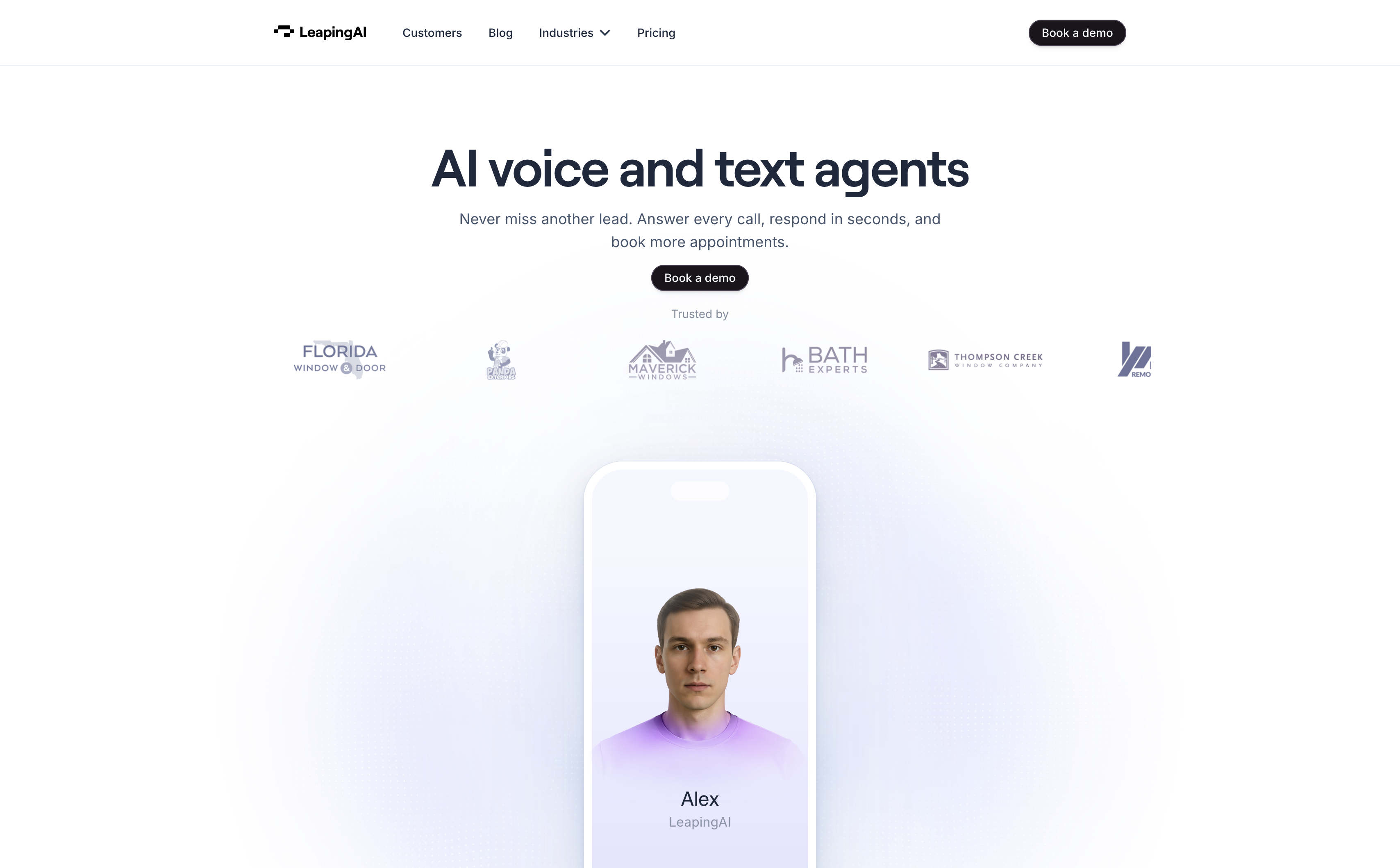
I've spent an unreasonable amount of time staring at the scroll-scrubbed hero on Leaping AI, and I can pinpoint exactly which frame does it: the one where the phone dissolves.
The phone doesn't scale up. Its chrome collapses into a small iOS-style call pill while the synthetic human inside it grows past the frame that was holding him. That is the move. That is the whole reason this site is in my folder. Everything else on the page is competent, restrained, and mostly unremarkable. But those 2400 pixels are one of the smartest scroll sequences I have seen in a year.
The site sells synthetic voice agents that answer your phone. A category where most competitors show you a dashboard or a waveform. Leaping AI refused both and committed to a rendered human named Alex as the entire visual identity.
The scroll-scrubbed hero, measured
The mechanic is measured. The pin engages at scroll y≈450 and releases at y≈2850. Across that runway the hero container grows on two clean linear segments: about 0.131px of width per scrolled pixel before a layout switch at y≈1200, and roughly 0.232px/px after. That is genuinely scroll-linked scaling, not a set of keyframes trying to fake it. No single scroll tick produces a visible jump. It feels less like an animation and more like the device is quietly getting closer to you.
That distinction matters more than it sounds. Discrete keyframes at this duration would read as stuttering. A linear ramp against scroll position converts the pin into a dolly. The visitor experiences progress as approach, which is why 2400px of held pin doesn't feel like being held hostage.
The engineering hiding inside the shirt
Here is the detail I want to frame. Alex wears a violet shirt that fades to near-white at the hem. That is not a styling decision. It is load-bearing layout engineering.
Because the shirt gradient exists, dark navy headlines can be set directly on top of the figure's body without a scrim, a plate, a card, or a shadow. The composition gets to have a full-bleed synthetic human AND a legible headline in the same 900 pixels of viewport. Remove that gradient and either the type moves off the figure or the figure has to shrink to make room. Neither preserves the argument.
That is the kind of decision that only happens when the art direction and the layout are being designed by the same person at the same time. Most teams would have shipped a solid violet shirt and a scrim behind the type. This one shipped a gradient because they knew the type had to live on the body.
Three acts, one subject
The other thing I keep coming back to: the pin runs three discrete content acts over one continuous transform.
Act one shows the phone in a call state with the agent's own system prompt floating beside it as decoration. Act two collapses the phone chrome into a Dynamic Island pill while six greyscale customer logos orbit behind the figure's shoulders in soft rounded rectangles. Act three keeps the same figure but morphs the satellites into full-colour circles carrying Google, HubSpot, Salesforce, Zendesk, Tableau, and Zapier marks. Same orbit, different geometry, different meaning.
The visitor reads the change pre-verbally. Muted rectangles say "these are customers." Saturated circles say "these are integrations." The headline confirms it after the shape has already argued it. Recreations that render both sets identically lose the argument even if every pixel of geometry is right.
The figure never changes. The argument does. That is a real editorial idea rather than an effect.
What the restraint buys
The rest of the palette is doing quiet work to make room for the spectacle. One near-white ground. All type set in #1D293D navy instead of black. A single violet accent family. Tracking on the headings pulled to -0.03em on Roobert SemiBold at 64px. No gradients on type. No hard shadows anywhere. Exactly one dark section inversion at the two-thirds mark.
The narrator on my capture said "very, very subtle" three times in twenty seconds. That is the reaction the team was going for. Loud ambience reads as a template. Quiet ambience reads as expense. This page reads as expense.
Do I have complaints? A few. The heading typeface ships as "Roobert TRIAL," a licence file that survived from design exploration into production, on a company that displays SOC2 and HIPAA badges in its own footer. The "How we work with you" section is written entirely for home remodeling on a homepage that leads with an airline. And there is no prefers-reduced-motion block anywhere on a site whose centrepiece is a 2400px scroll-scrubbed scale. Those are cleanup items. The idea itself is intact.
What I want to steal
Three moves I want to lift out of this and use somewhere else.
First: dissolve containers instead of scaling them. When something has to outgrow its frame, collapse the frame into a smaller residual token rather than blowing it up 3x. Scaling a phone bezel to hero size would just look wrong. Dissolving it into a call pill reads as a change of reality.
Second: engineer the imagery to be a surface. Design assets with a built-in gradient-to-background falloff so type can live directly on them. A full-bleed subject and a legible headline stop being a conflict.
Third: change shape and saturation to change meaning. Rectangles versus circles. Muted versus saturated. Let the geometry do the work a caption would do worse.
The site does about six other smart things I didn't cover, and skips a few obvious ones I would have added. The pin is the whole reason it is on this list. One good idea, spent hard, in the exact place a visitor is looking.
Want a site that thinks this hard about one move?
The pin on Leaping AI works because someone made an argument about what scroll should mean on this specific page, then engineered the imagery, the palette, and the choreography around that argument. That is not a template setting. That is a decision, made once, and defended through every downstream choice.
That is what we do at Crazy Creative. Sites where the marquee move exists because the strategy asked for it, not because the section library included it. If you want a homepage that stops a designer cold and holds them there for 2400 pixels, the studio lives at crazycreative.design.