

Hello, I'm Nick. I design insane websites and user interfaces.
This is where I talk about all of the cool sites I find online.
I've watched the hero on Mistral's homepage do its trick probably fifty times this week. Scroll, reset, scroll again. There's a specific thing happening in that first viewport that I want to sit inside for a while, and it's the reason this site is at the top of my enterprise AI homepage design folder right now.
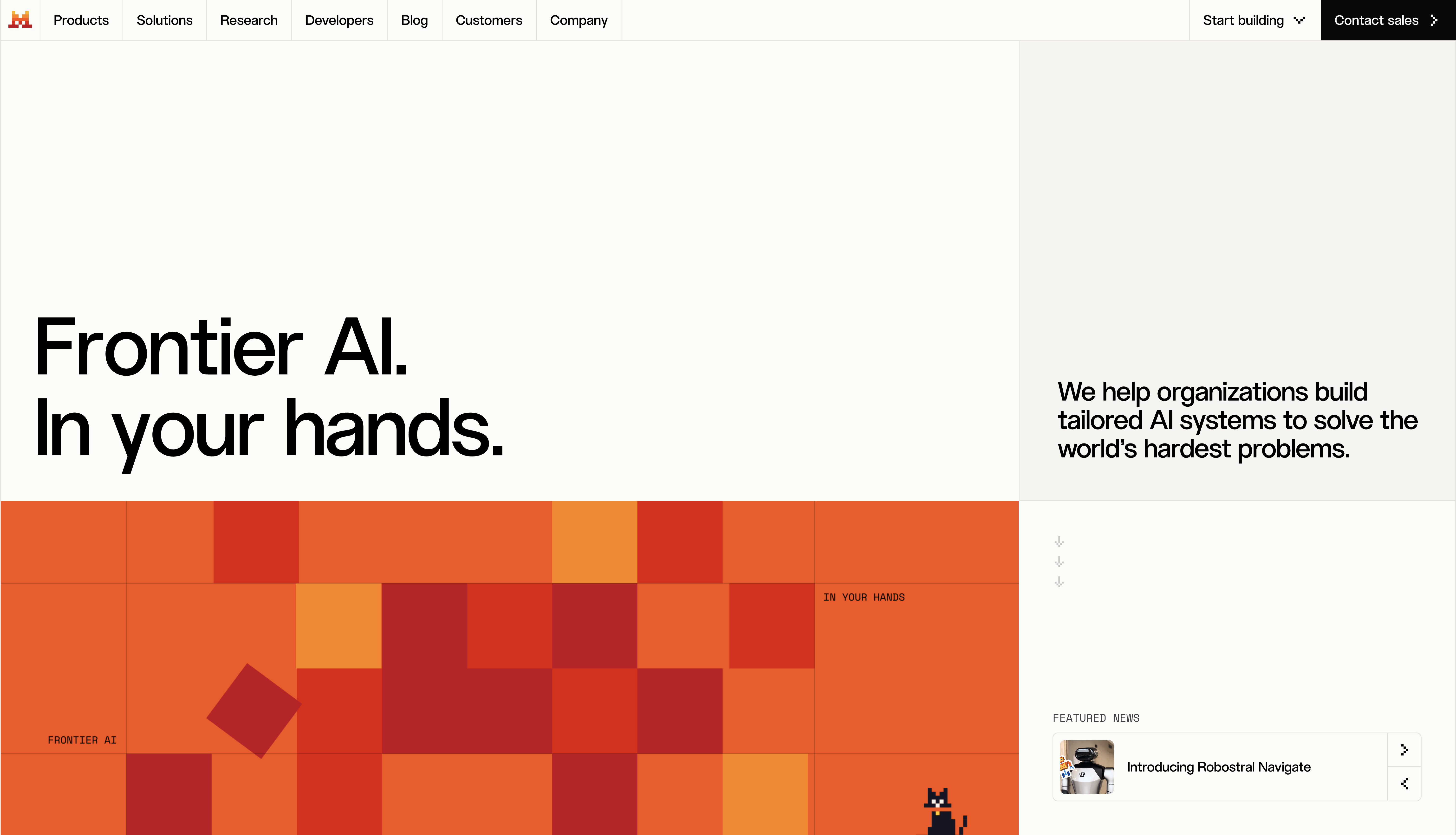
If you haven't seen it, on mistral.ai the opening frame is a two-column split on warm off-white cream. The left 70% is a display headline in a confident editorial sans, sitting in a lake of whitespace. The right 30% is quieter, a small paragraph, some pixel-art icons, a featured-news card. Then you start scrolling.
The right column doesn't scroll. It pins itself to the vertical center of the viewport and waits. The headline on the left rolls up and out. And then the paragraph on the right, the one you barely registered as secondary, enlarges into the primary headline slot and becomes the statement. The page has literally handed the microphone from one column to the other.
The move is nothing but position: sticky
Here's the part that got me. The whole choreography is powered by CSS. position: sticky; top: 0; height: 100dvh on the right column. Native scroll on the left. A grid that reflows from 70/30 into a centered single measure as things settle. There's a delayed 600ms fade-in on the pinned block (js-col-middle-middle), and that's basically the trick.
No GSAP, no Lenis, no Framer Motion, no ScrollTrigger. Every scroll-jacking library the AI-marketing category defaults to, Mistral refused. The signature interaction on the whole homepage, the thing the design lead recorded a voiceover to explain, is executed on native scroll and a sticky wrapper.
I've been trying to build hero effects like this with a JavaScript timeline for years. Watching Mistral do it with sticky positioning felt like watching someone reach for a paintbrush after I'd been trying to solve the same problem with an oil rig.
The proof that the restraint funds the peak
This site works because 95% of it is quiet on purpose. The base is a warm cream (#fbfbf8 primary, #f5f4ef secondary), never pure white, because paper warmth is doing quiet emotional work. Every grid cell is divided by 1px #e4e3de hairlines on a grid-cols-10 scaffold. Body copy is muted gray Inter. Category pills are Space Mono uppercase, letter-spaced and small, framing content like a machine reading it (ENTERPRISE KNOWLEDGE SEARCH, INFINIBAND FABRIC, AI DEPLOYMENTS DESIGNED FOR PRIVACY).
Hovers are 150ms color-only whispers on the standard cubic-bezier(.4,0,.2,1) curve. Nothing bounces or lifts. The micro-interaction layer is austere on purpose.
Which means when the hero swap runs, the whole motion budget lands in one place. The rest of the page can afford to be systematic (six templated product rooms in orange, navy, blue, orange-red, yellow, cream) because the opening move has already spent the drama.
Restraint as a budget is one of the more mature ideas in front-end design, and this site models it cleanly.
The pixel mosaic is both the identity and the primitive
The other detail I keep chewing on. Mistral's brand is a grid of colored squares. Not a logo that references a grid, not a system inspired by pixels. The literal mark is an 8-bit "M." The hero mosaic is #ff5229 / #e51300 / #ff8204 tiles with a couple of oversized red diamonds rotated 45°. The mascots (a cat, a robot, a gem, a lotus) are 8-bit pixel art. The product scene backgrounds are pixel grids in each product's color world (Vibe orange, Studio electric blue, Forge orange-red, Compute tangerine-yellow).
And the motion system runs on the same primitive. The mark assembles on load from tiles flying in from four directions (brand-from-left/top/br/tl, 0.7s ease-out, staggered .1s/.4s/.5s/.55s). The product bento cards fall in with bento-fall, a squash-and-stretch keyframe that runs scaleY 1 → .95 → 1.02 → 1 so flat pixel tiles land with actual physical mass.
The atomic unit of the identity is a colored square. The atomic unit of the motion system is the same colored square, in flight. Which is why the animation never feels applied on top. It feels like the brand is what's moving.
What most enterprise AI homepage designs do instead
The category default is depressingly consistent. Gradient meshes that look like Stripe filtered through a lava lamp. Abstract 3D blobs floating in dark mode. A hero video of servers pulsing in blue neon. Every enterprise AI landing page reads like it was assembled from the same six Framer templates.
Mistral picked a warm cream canvas and a pixel cat. That was a bet. It hedges nothing. And it's the exact move that made me stop scrolling and actually read the frontier-model copy underneath.
What I'll steal
Two things. First, I'll stop reaching for a scroll library the next time I need a hero interaction. position: sticky and h-dvh will get me further than I'd assumed. Second, I'll spend more of my motion budget on one memorable move and let the rest of the page behave. The Mistral site is basically a proof that one great scroll interaction beats twelve mediocre ones.
Also, unrelated. I'm going to keep an eye out for pixel cats.
Working on a homepage that has to feel like this?
At Crazy Creative, we build sites where the signature interaction is designed alongside the visual system, not layered on afterward, and where the rest of the page is disciplined enough to make that signature moment land. If your product deserves an opening that people actually watch, that's the kind of work we do. See what we've built at crazycreative.design.