

Hello, I'm Nick. I design insane websites and user interfaces.
This is where I talk about all of the cool sites I find online.
Most community products reach for the logo wall the second they need social proof. Six gray rectangles. A row of half-recognizable marks. A vague claim of authority by proximity. It's the default, and the default is going stale.
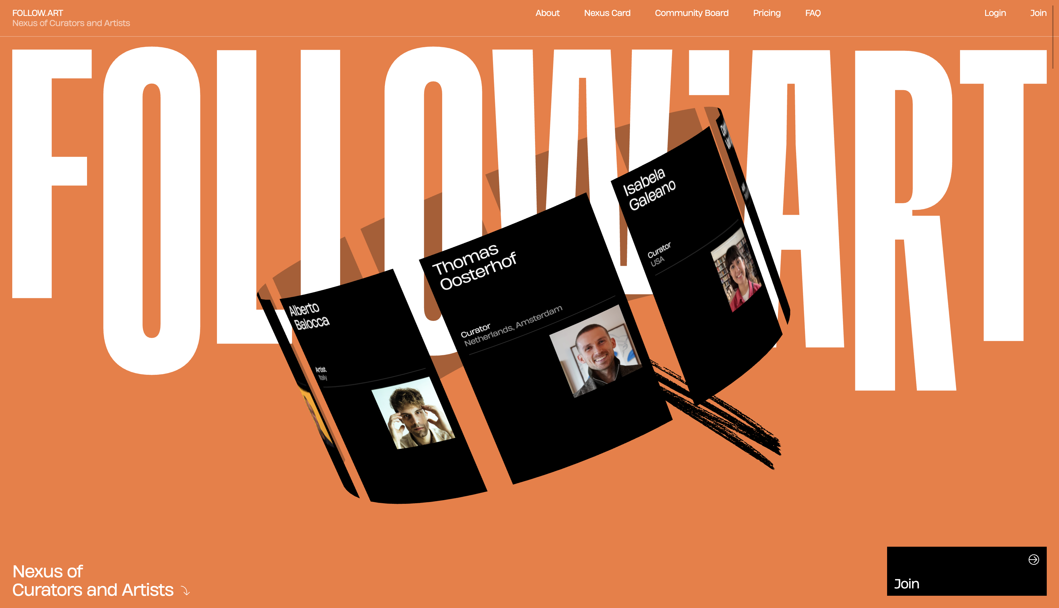
FOLLOW.ART replaces it with something better. A horizontally scrolling strip of real member names, each paired with a role label. Teona Toderel, Artist. Erin J Coholan, Artist. Baimba Kamara, Curator. Alberto Balocca, Artist. The list loops. The strip moves at a quiet pace. The whole thing reads less like a credentials parade and more like a guest list.
That single swap reframes the page.
Why the name marquee works as social proof
A logo wall says "look who pays us." A name marquee says "look who is here." For a community product, the second claim is the one that matters. Memberships are not vendor relationships. Nobody joins a curator network because Bloomberg's logo is on the homepage. They join because they recognize the names of people they want to be in a room with.
The marquee also works because it is kinetic without being noisy. Motion is the page's signature element. Everything else on FOLLOW.ART is held still. The wordmark sits. The numbered pillars sit. The Nexus Card sits. Then a band of names rolls slowly across the screen and the whole page wakes up. One moving thing, applied in one place, becomes a brand fingerprint instead of a distraction.
And the typography does load-bearing work. Names set in display weight, role labels set smaller and quieter, paired through a consistent typographic relationship. The marquee is a typesetting exercise, not a widget. That keeps it on-brand for a site whose whole identity is editorial restraint.
The conditions that make it work
The pattern is not free. It only works when three things are true.
First, your audience knows people by name. Art-world insiders recognize curators the way film people recognize cinematographers. If your audience reads names as anonymous, the marquee falls flat and you should still use the logo wall.
Second, your members are willing to be named. A list of real humans tied to real identities is a higher-trust artifact than a list of company logos. Some communities want pseudonymity. Some communities want privacy. If yours does, this pattern is the wrong tool.
Third, you have enough members. Twelve names looping looks confident. Four names looping looks like you ran out. FOLLOW.ART runs the list long enough that the loop feels like a snapshot of a larger room.
When those conditions hold, this is the move.
The category default it's replacing
Most community landing pages still copy the SaaS playbook. A logo strip near the top. A testimonial carousel further down. A press-mention bar somewhere in the footer. All three patterns assume your authority comes from external validators, that you need a brand bigger than yours to vouch for you.
A community product's authority comes from inside the room. Whose attention you have. Who shows up. Who lets their name appear next to yours. The marquee makes that visible in a way the logo wall never can. It also doesn't pretend that a community-of-curators credentials itself through Forbes or TechCrunch. It credentials itself through curators.
The closer you look at FOLLOW.ART, the more you notice that this is not a marketing flourish. It's a positioning statement set in motion. The page is loud about being anti-algorithm, anti-gatekeeping, anti-paywall. Showing real names instead of company logos is the same argument in typographic form. We are a network of people, not a network of brands.
What to take with you
If you're designing for a community product, swap the logo wall for a name marquee and watch the page change posture. Pick one motion element and let it carry the kinetic weight. Trust your members enough to put their names on your homepage. Trust your audience enough to assume they'll recognize them.
The pattern is small. The effect is not.
Working on a community site that needs to feel real?
If your homepage is currently doing the logo wall thing and you suspect it isn't earning the trust you wanted, you probably need a sharper social proof strategy and a design system that can actually deliver on it. That kind of detail is the work we do at Crazy Creative. The studio lives at crazycreative.design.