

Hello, I'm Nick. I design insane websites and user interfaces.
This is where I talk about all of the cool sites I find online.
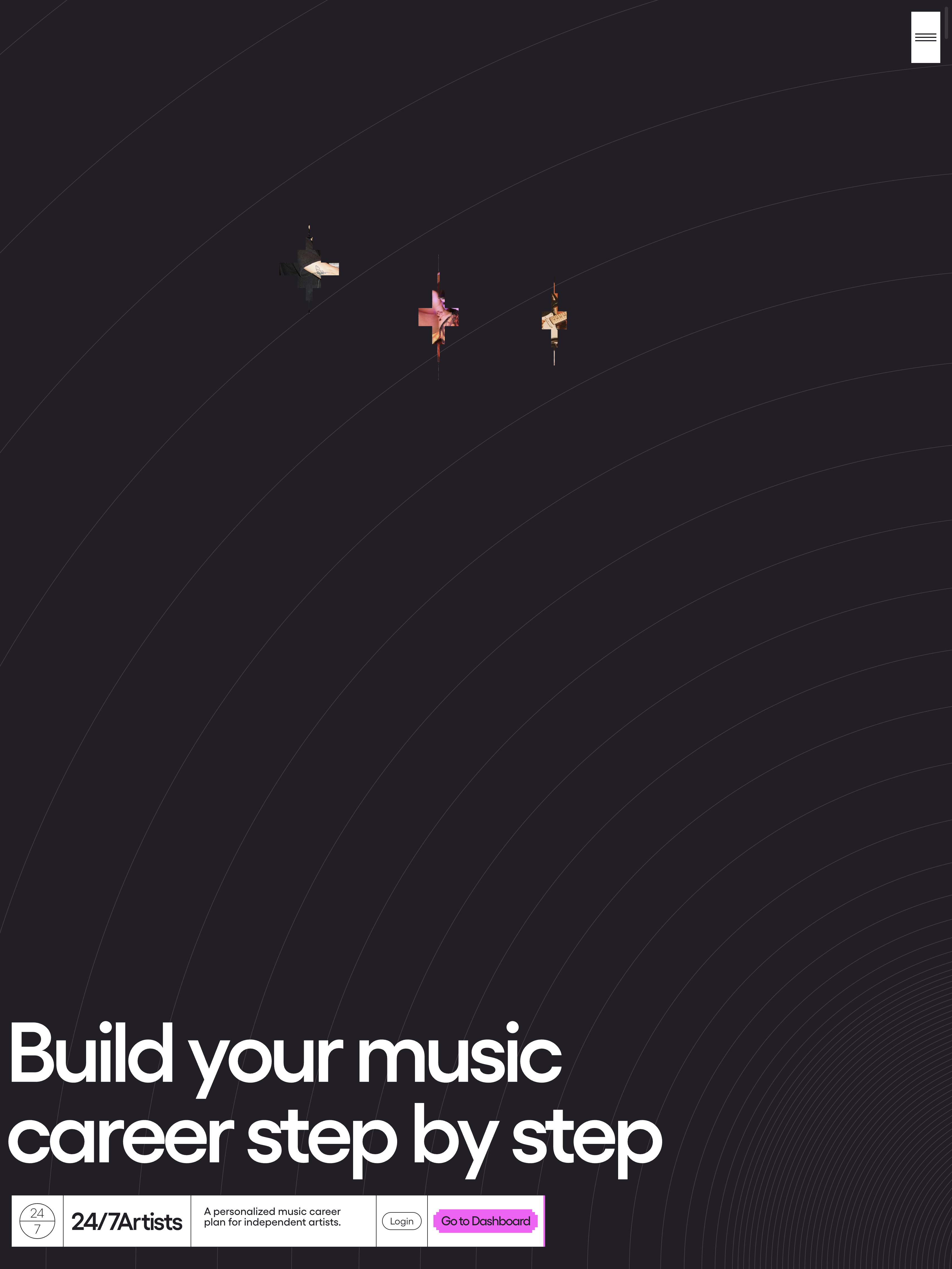
I've spent way too long staring at one hex value on 24/7 Artists. Not the headline. Not the scroll trick. Not the four looping videos scrubbed inside a four-viewport pinned section. The ink color. #231E25. A warm-black plum that sits on every chapter of this site, no matter what background color the chapter happens to be that minute.
It's a tiny choice. It's also the choice doing all the work.
Open the site and the homepage is a rainbow descent. Red-orange, cream, lime, amber, near-black, lavender, salmon. Twelve saturated swatches in total, deployed one per full-bleed chapter, with no two accent fields ever sharing a viewport. On paper that sounds like a UI car wreck. In practice it reads as a single calm system, and I keep coming back to figure out why.
The Ink Never Leaves
The warm-black #231E25 is constant. The H1 at 152px in the hero uses the same ink as the 18px body buried in the FAQ at the bottom. The course list on the lime field uses the same ink as the pricing tier names on the lavender field. Every piece of text, every label, every number on this site is one color.
That sounds like a constraint. It's actually a release valve. With the ink locked, the team gave themselves permission to do something most sites would never try. They painted an entire viewport #FF4337 red-orange, then painted the next viewport #ABF139 lime, then sat you down on #FEB804 amber and asked you to read five tool descriptions. The maximalism is real, but the discipline is invisible. You don't notice the rule, you notice the ride.
Compare that to the default move. Most color-heavy sites recolor the text alongside the background. Light field gets dark text, dark field gets light text, and somewhere along the way a quote earns a brand accent or a hover picks up a tertiary hue. It always reads as accumulated rather than designed. 24/7 Artists refused that move entirely, and the constant ink is the single thing that lets every other choice go loud.
The Black That Isn't Black
The other piece I keep noticing is that #231E25 is not #000. It's a warm plum-black that pulls the whole palette toward warmth. True black on #ABF139 lime is a fluorescent eye-strain test. #231E25 on #ABF139 lime is still vibrating, but vibrating in a register the eye actually wants to live in.
That warmth runs through the whole system. The cream chapter is #fff0d2, not white. The off-whites are warmed. The ink is warmed. The palette could read as candy-colored kids-show territory and instead it reads as adult, considered, almost editorial. The warming is the bridge between bold color and grown-up taste. If you copied this site and used #000 and #fff you would lose the entire mood. The hex codes are the design.
One Typeface Doing All the Heavy Lifting
While I'm here, the other thing the ink discipline frees up is the type. Gellix, one face, from 18px to 180px. The hero H1 sits at 152px with letter-spacing at roughly negative 0.06em and a 0.95 line-height. The about-section statement runs at 180px. The body copy is 18px. That is a ten-times jump from smallest to largest, executed in a single typeface with no weight changes carrying the drama.
When the ink is constant and the field changes and the type stays one family, the only thing left to modulate is scale. So they modulate scale recklessly. The hero at 152px is loud, and the about statement at 180px is louder. It works because everything else is locked down. You get to be reckless about one variable when the other three are nailed shut. That's the trade the whole site is built on.
Color-Block Web Design That Doesn't Collapse Into Noise
This is the recipe I want to remember. If you want to do color-block web design at full saturation, you don't also get to vary the ink, vary the typography, and vary the motion temperament. Pick one constant and let it carry the whole maximalist load. 24/7 Artists picked the ink. The result is a site that punches like a children's bookstore window but reads like a paperback you actually want to finish.
The discipline is hidden inside one CSS variable. A single --color-text value reused everywhere. A token most teams treat as boring is the thing carrying the entire identity. The boring choice is the brave choice. I'm going to keep that one in my back pocket for a long time.
Want a site that holds together this way?
The whole reason 24/7 Artists works is that the quiet decision is locked before the loud ones get to play. That's a tradeoff most sites refuse to make, and it's the kind of foundation we obsess over at Crazy Creative. If you've got a brand with big color ambitions and you want the result to read as designed instead of busy, the studio lives at crazycreative.design. Come look at what happens when the boring tokens do their job.