

Hello, I'm Nick. I design insane websites and user interfaces.
This is where I talk about all of the cool sites I find online.
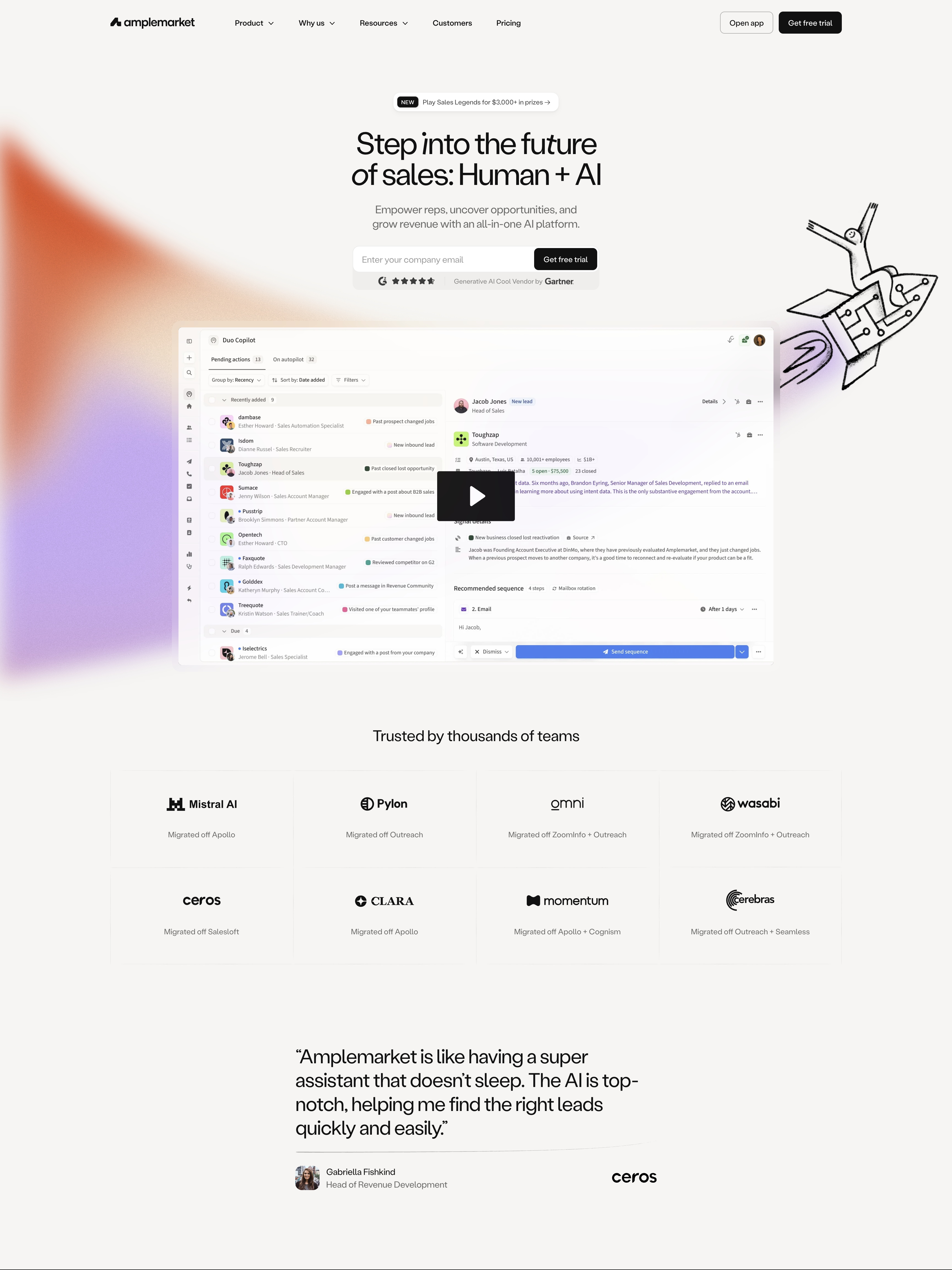
I keep coming back to Amplemarket for a single technical move I hadn't seen a brand team execute this cleanly before. It's a small thing. It's also the whole b2b saas homepage design inspiration I've been chasing for months.
Here is what is happening in the hero. There is a raw WebGL gradient field, hand-written GLSL, breathing on a canvas element. There is also an SVG path drawn in ink, a rocket exhaust plume rendered as if someone sketched it in a notebook. The shader light does not fill the screen. It only shows inside the doodle. Machine light rendered through a human mask, composited into the same image, and subtly warping around the cursor via a u_mouse uniform driving a domain distortion.
The whole company sells "Human + AI." Most brand teams would put that phrase on a t-shirt and move on. This team turned it into a compositing pipeline. The shader graph and the brand argument are the same object. That is rare enough that I had to sit with it.
The specifics that make it stick
If you crack open the site, the ideology extends all the way down. One variable typeface (Labil Grotesk) does the entire typographic universe. The trick is that every major headline splices one or two italic-alternate characters mid-word, so machined type gets a tiny human glitch inside it. There is no second font. Expression comes from size, from caps, from italic flicks, and from a foil-gradient fill reserved for the ALL-CAPS midnight-indigo banner reading "START YOUR SUPER SALES JOURNEY." That is the entire type system.
Color follows the same logic. Warm ink #111 on warm bone #F6F5F3. On dark bands, warm charcoal #272625 cards instead of pure black. No true black or white anywhere on the site. Four pillar hues (#328EFA blue, #E16540 terracotta, #FBC768 amber, #47D096 green) code the product areas and refuse to decorate. Pastels only appear inside stat cards, one shade per customer proof.
Motion follows the same restraint. Hover is chromatic only. Nothing moves, lifts, or shadows. Two ease-out curves at three tempos (0.1s nav, 0.25s micro, 1s reveal) govern everything. Ambient life is granted to exactly three zones that carry the product story: the shader plumes, three counter-scrolling signal-chip tickers that decelerate exponentially on hover using v += (target − v) * 0.05, and per-persona masks re-lighting through different brand doodles. Everything else stays still.
Name the enemy
Most sales-tech landing pages look like the same Stripe screenshot with a gradient blob over it and a "Get a demo" button. That whole category is drowning in the sameness of default AI tooling. Amplemarket refused. It picked a warm paper canvas, a single italic-flicked grotesk, and an ink-doodle illustration system. Then it engineered custom code (raw WebGL, parametric SVG masks recomputed on resize, mouse-reactive domain warp on the plume) to make the machine light show only inside the hand-drawn shapes. Every one of those decisions is a decision most companies at Amplemarket's stage would not make.
It is a reminder that "premium SaaS" is not a category constraint. It is a place brand teams stop looking.
What I'm taking with me
The lesson I keep circling is that the brand thesis should live in the render pipeline. When Amplemarket's designers put "Human + AI" on the wall, the engineer next to them started thinking about mask compositing. That is a specific working relationship, and it is what distinguishes a marketing site with taste from a marketing site that is genuinely made.
The other thing I'm taking is the italic-flick move. One variable font, one alternate character spliced mid-word, and the personality is delivered at zero runtime cost. No motion needed. No second typeface. Just typography that leans slightly, once, in the right place. I have been trying to figure out where to steal it since I first saw it.
Building a site where the brand idea shows up in the render pipeline?
If the phrase your company puts on a slide is supposed to show up in the way the site actually renders itself, that is what we do at Crazy Creative. We treat the thesis as a compositing decision instead of a slogan on a hero. If you want that treatment on your own site, the studio lives at crazycreative.design.