

Hello, I'm Nick. I design insane websites and user interfaces.
This is where I talk about all of the cool sites I find online.
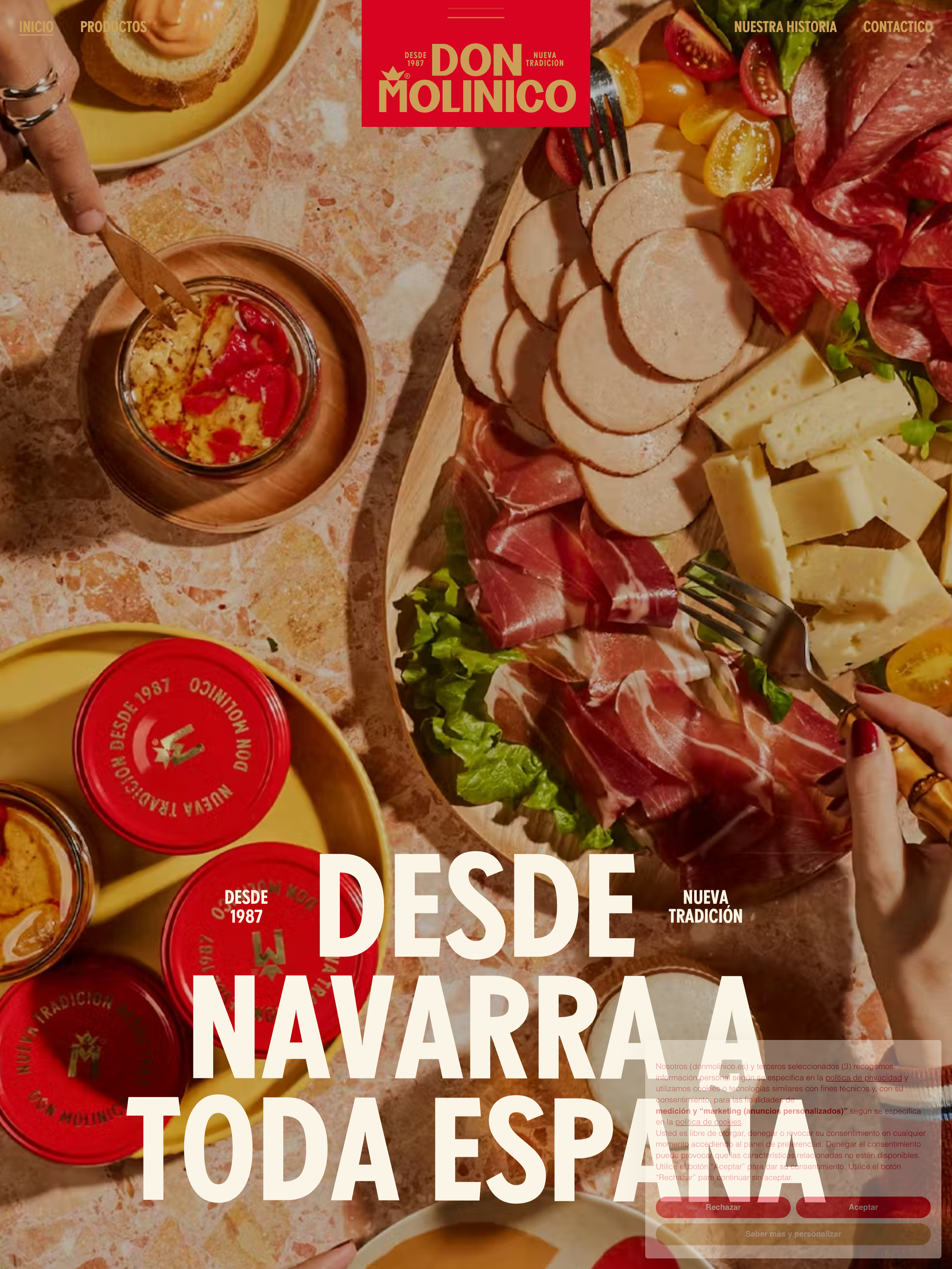
I've been scrolling through Don Molinico for weeks and I still can't decide which decision I admire most. But there's one that keeps pulling me back, and it's not the vermilion. It's what the site refuses to do.
Nothing on Don Molinico bounces. Not the hovers, not the card reveals, not the menu opens. Every easing curve on the site lives inside one family, and that family is deceleration only. cubic-bezier(.165,.84,.44,1). cubic-bezier(.19,1,.22,1). power4.out. That's the whole motion vocabulary. Things arrive and settle. Nothing springs, nothing overshoots, nothing wobbles for a millisecond to prove it's alive.
That refusal is the site's entire personality.
Why the discipline reads as expensive editorial motion design
Most product sites in 2026 lean on some kind of playful counterpoint. A bounce on the CTA. A little rubber-band on the card that says "I'm interactive, I promise." It's the design equivalent of clearing your throat. Cute at low doses, exhausting at scale.
Don Molinico simply cuts it. The Awwwards SOTD credit goes to AUGE Experience, ET Studio, and Francesco Prisco, and the motion decisions read like a system three studios negotiated down to their most defensible position. When multiple teams work together, restraint tends to win. Nobody wants to defend the fifth bouncy easing curve when the fourth one already felt like too much.
The cubic-beziers they chose aren't arbitrary. Both .165,.84,.44,1 and .19,1,.22,1 are aggressive decelerations with steep initial velocity and a long tail. Things move fast and then settle for a beat longer than you'd expect. That extra half-second is what makes the whole thing feel considered. Bouncy easings resolve too fast, which is why they read as young. Deceleration easings take the extra time to arrive, which is why they read as expensive.
Lenis and ScrollTrigger, in agreement
The other reason the discipline holds is that the smooth-scroll system agrees with it. Lenis governs the whole scroll cadence, so every wheel and trackpad input gets interpolated into a decelerating curve before it reaches the DOM. Then ScrollTrigger inherits that character for its reveals and pins, using the same easing family Lenis is already speaking.
That's not accidental. That's a designer-engineer agreement, codified in imports. Someone on that team drew a line and said we import deceleration and nothing else. No back.out, no elastic.inOut, no spring-physics library sneaking in for one clever hover on the flavor switcher.
The result is that the site has one tempo throughout. Read the Origin essay, hover the primary CTA, watch the HomeStickySection pin and scrub through its brand narrative with the Three.js product model rotating on scroll progress. Everything arrives and settles at the same rate.
I keep coming back to this because in every client kickoff I've had this year, someone has said "we want it playful" and meant "we want it bouncy." Don Molinico is the counterexample I want in the deck. Playful is a personality. Bouncy is a default.
The one accent that lets the restraint hold
None of the motion discipline would work if the rest of the site were also whispering. What makes it hold is that Don Molinico screams in a different register. Visually.
There's one saturated color on the site. Vermilion at #D70321. It's the CTA, the hover destination, the accent, and the third-party cookie banner theme. Iubenda gets themed to brand red with backgroundColor:"#FBF5E7", acceptButtonColor:"#D70321", and linksColor:"#D70321". Even the consent modal lives inside the system.
Against a cream parchment field at #FBF5E7, that red does almost all the identity work. Add gold #CB9F57 for the middle warmth, deep-red #9F0005 for hover depth, and ink #363636 for text, and you have the whole palette. Five tokens with no tint scale and no category colors.
That's why the deceleration reads confident instead of sleepy. If the palette were also polite, say a soft mint or a corporate teal, the settled motion would tip into inertia. But the red is loud. The type is oversized, riding at 85–90% line-height on the display cuts, tight enough that headlines feel packed. The photography is warm and naturalistic. All the visual signals shout confidence. So when the motion refuses to bounce, it reads as "we don't need to bounce," not "we forgot to."
What I'm taking from this
The lesson I'm walking out of Don Molinico with is that motion vocabulary is a system-level decision, not a per-component one. Pick your easing family and enforce it everywhere: bridge it through Lenis so the browser's native scroll physics respects it, extend it to your third-party UI so the cookie banner doesn't break frame, and trust that the visual system will hold the personality when the motion refuses to counterpoint itself.
Every product site I've briefed since I first opened this one has a spec item that reads "no spring physics." That single constraint has done more for the feel of those builds than any color decision I've made this year.
Building something that needs to feel this considered?
If you're building something where the whole brand needs to move in agreement, from easing curves to smooth-scroll cadence to how the cookie banner behaves, Crazy Creative works this way by default. We codify the easing family before the first component ships and we make sure the third-party UI doesn't break frame. See what that looks like at crazycreative.design.