

Hello, I'm Nick. I design insane websites and user interfaces.
This is where I talk about all of the cool sites I find online.
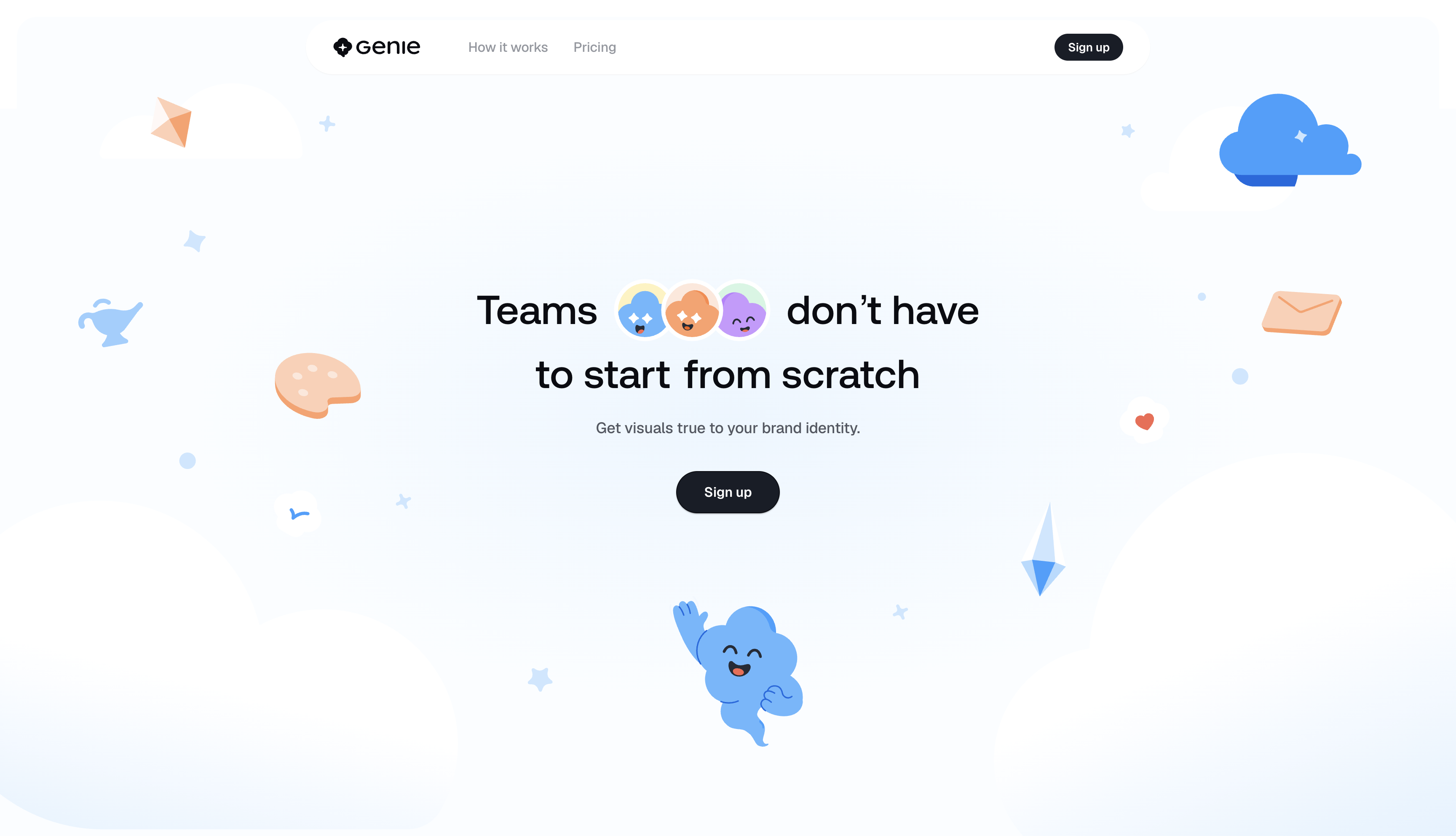
I've watched the + Create button on Geniestudio become an app about forty times. That's not hyperbole. I scroll to it, scrub back, scrub forward, close the tab, open it again the next day. It's the kind of move that hooks a designer the way a piece of music hooks a musician. You can't stop pulling it apart.
Here's what happens. A "+ Create" pill sits inside a sentence on the page. Normal, small, unassuming. You scroll, and the pill starts to grow. It scales up, drifts to the center of your viewport, and then the charcoal fill of the button just spreads. It swallows the frame. The button isn't opening a modal. The button is becoming the viewport. Peach warms up inside it, the workspace assembles, and by the time the pin lets you go, the same "+ Create" pill is sitting in the bottom of a prompt composer as the actual submit button of the tool you're being sold.
The claim and the product are the same object. That's the trick. And the whole thing runs on 1,800px of scroll-scrubbed Rive.
The proof, since I don't trust my own reaction without it
I have this rule about only letting myself get excited about a design decision if I can back it up with numbers. So I opened the DOM.
The scene lives in a single Rive file, /rive/create_with_one_click/create_with_one_click.riv, weighing 122 kB. That's it. The entire signature moment on this page. It runs on @rive-app/canvas@2.31.5 inside a single 1440 × 900 canvas, and the pin holds you inside it for 1,800px of scroll runway. At 33% progress the pill has become the viewport. At 50% the peach workspace fills the frame. At 83% the composer arrives with the same pill seated in it. The .riv bundles its own Geist and Aeonik font files so the type inside the canvas matches the type outside it exactly. You can't tell where the DOM ends and the canvas begins.
The choreography is scrubbed, not triggered. You perform it with your wheel. Which means you can scrub it backward and watch the workspace collapse into a pill. Try it. It's better in reverse.
What sold me was how quiet the rest of the page had to get
A move this loud only works if the surrounding site earns silence. Geniestudio does the work.
The whole page is set in one display face at one weight. Aeonik Medium, from 24px up to 148px. No bold, no light, no italic, no second family. Hierarchy comes from size alone. Body copy is Geist at a steady half-tone quiet gray (#535862), and quotes drop to #93979F because they aren't asking for your attention. They're just there if you want them. Every card on the page measures box-shadow: none. Not "subtle shadow." None. Testimonial cards, feature cards, the pricing card, style wheel cards. All flat. Depth gets saved for the two moments the page actually rotates in Z.
That's what makes the button-becomes-the-product move land. If everything were floating and shadowed and shimmering, one more piece of choreography would just add to the noise. Because the page is disciplined about stillness, the peak has somewhere to escalate to.
The specificity that keeps me coming back
Whimsy without specificity is greeting-card energy. I've flinched at plenty of AI-product landing pages that lean into cute illustrations and rounded shapes and mean nothing by any of it. Geniestudio's whimsy is anchored. When you hover a card in the style wheel section, it names the illustration set. "Open Peeps, by Pablo Stanley." "Undraw." Real third-party libraries, credited by name. When the pricing card says "per month / dreamer" it also says "200 Genie credits" and "$15." Every fluffy phrase gets docked to a checkable fact.
There's a five-hue pastel chip vocabulary running through the whole page. #FFCFB4 peach, #99CFFF blue, #A8ECC7 mint, #E4CCFF lilac, #FFF2BE butter. Those five colors appear at chip scale, at card scale, and at cloud scale, and no other saturated hue interrupts them. The page reads as one system because it is one system.
And there's a 302px gradient wedge. Same primitive, three times. linear-gradient(177deg, A 2.88%, B 97.51%). It's not a hard section edge and it's not a full-bleed cross-dissolve. It's a short band at a 3-degree tilt off horizontal that changes the page's key from blue to lilac right before the create sequence hits. The color transition is invisible as a line. It's just a change in temperature. Whoever authored that wedge exported it from a real design file with those specific stop percentages, because those aren't numbers anyone types by hand.
One honest beat before I finish praising it
The button that hooked me is a picture of a button. It's painted inside a canvas. It has no href, no cursor change, no hit target. The peak moment of the entire page, the moment a visitor most wants to press the thing, accepts nothing but more scrolling. That's a real tradeoff, and it's worth naming. The morph fidelity is not buildable in CSS at this quality, so painting it in Rive is a defensible call. Not overlaying a transparent anchor on the canvas during the final 20% of the pin is the less defensible one.
I still love it. I'd love it more with a link on top.
What I'm taking into my own work
The idea I can't shake is this. Argue by identity rather than by demonstration. A conventional landing page for an AI design tool would show a button, screenshot the result, and put a caption underneath. Geniestudio makes the button become the result. The visitor performs the transformation themselves with the wheel.
That's a different category of proof. And it changes how I want to think about the next hero I get to build.
Want a site that argues like this?
Most AI-product landing pages settle for feature lists and hoping the screenshots do the work. Sites that stake out real ground with scroll-scrubbed animation are rare, and building one well means holding a hundred small decisions still while one moment gets to be loud. That's the kind of build we spend our time on at Crazy Creative. If you're thinking about a homepage that has to argue by identity, the studio lives at crazycreative.design.