

Hello, I'm Nick. I design insane websites and user interfaces.
This is where I talk about all of the cool sites I find online.
I keep coming back to GoGetta for a lesson in restrained motion design. The whole homepage runs 11,401 pixels, and after the first four seconds it stops moving. Not settles down. Stops. Completely. And the site is better for it.
If you haven't seen it yet, GoGetta is a New Zealand recruitment-marketing platform. It has one authored motion moment and then nothing else across nine content blocks. That kind of discipline is rare enough that I want to talk about why I think it worked.
The one performance
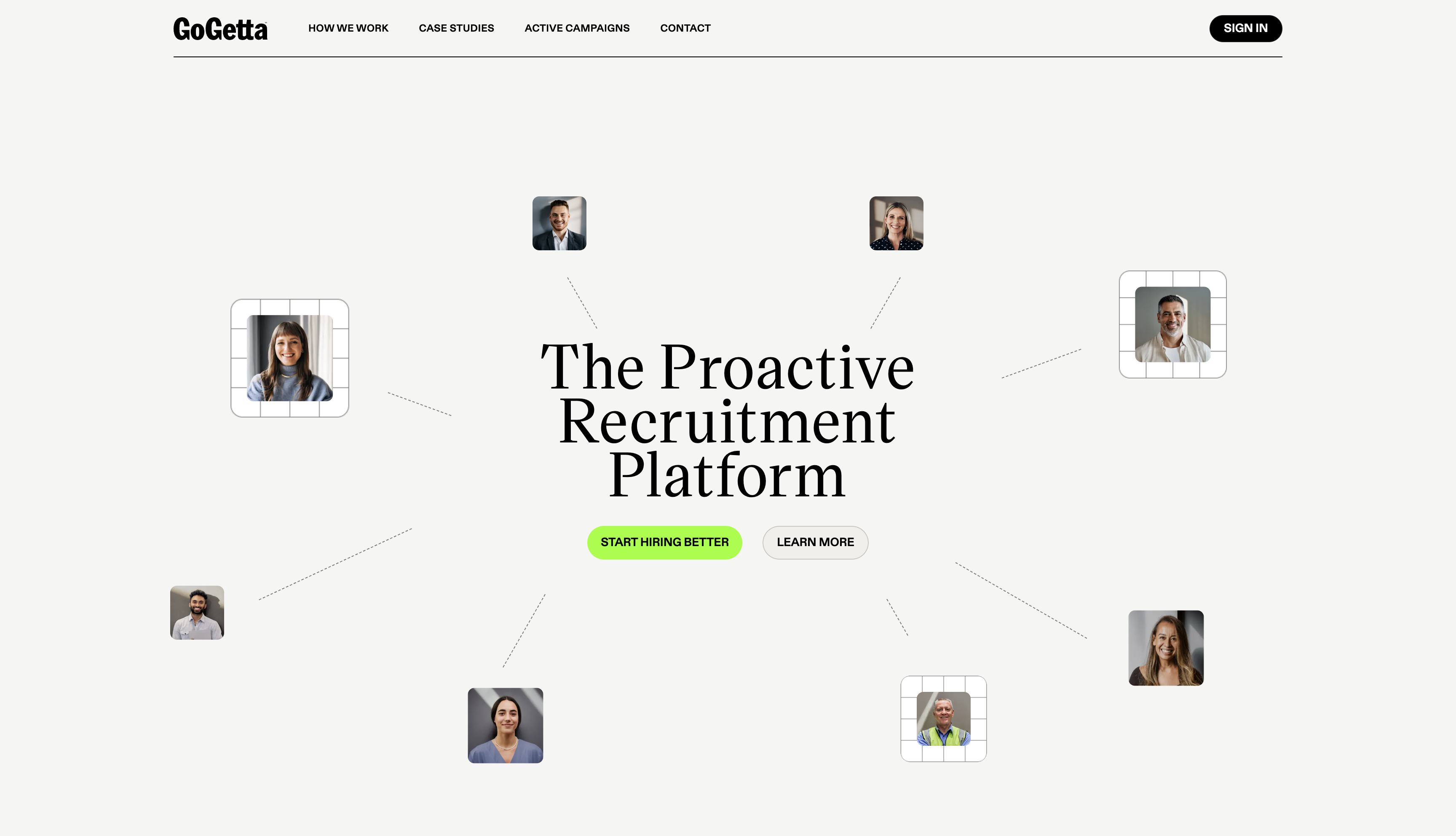
The hero is a constellation of eight portraits fanned around a serif headline. Each starts at opacity 0 with a matrix scale of 0.8. Then they fade in on a 150ms stagger, each running a 2050ms transition on a hand-rolled linear() easing ramp with roughly 200 stops. Front-loaded hard, then a slow tail. Opacity hits 0.56 by 350ms into a single tile's run, then takes another 1.4 seconds to crawl the last stretch to 1.0. The whole hero finishes assembling at 3.9 seconds.
3.9 seconds. That is a patient hero on the modern web. Most sites are done in 400ms and racing to the next thing.
And then the page stops. document.getAnimations() returns zero at every scroll position after that. No entrances on scroll. No parallax. No section reveals. No sticky pins driven by ScrollTrigger. The only continuous motion on the entire page is a client-logo marquee moving at 96 pixels per second inside a 608-pixel window, which is the visual equivalent of ambient noise.
What restrained motion design gets right
Here is the trick. The stillness only reads as composure because the site proved, once, that it knew how to move. That opening sequence is not off-the-shelf. Nobody accidentally writes a 200-stop linear() easing ramp on a 2050ms transition. A team that authored that curve chose, deliberately, to stop authoring curves for the rest of the page.
Which changes what the stillness means. On most sites, "no scroll animations" reads as "we didn't have time." On GoGetta, it reads as an editorial decision. Look at what the hero does, and then look at what the rest of the page refuses to do. You cannot mistake one for the other.
The rest of the design is set up to reward that stillness. Every card is shadowless, ringed with a single 1px hairline at 16% black, sitting on a warm off-white field of #F5F5F3. Depth is drawn, not lit. The one accent color, an acid lime at #93FF06, appears roughly once per section, never as a wash. Display type is a single serif at a single weight from 72px down to 28px, with hierarchy carried entirely by size and tracking. The hero headline is tracked to +1.8px. Every heading below it is tracked to -2.6px. That is the whole system.
None of it needs motion. Motion would in fact break it. If a card on the "How it works" section slid up into view on scroll, the print metaphor would collapse. The card would stop reading as ink on paper and start reading as UI. The whole visual system is calibrated to look like a magazine, and magazines do not animate.
The pin without a script
The one place a lesser site would have reached for a motion library is the "How it works" section. It runs 3,675 pixels. A third of the entire page. The left column holds a badge, a 52px headline, and a five-step index. The right column holds five stacked cards, each 570 to 702 pixels tall. The left column sticks and holds for 2,520 pixels while you read the cards.
Every current instinct says GSAP ScrollTrigger. Pin the column. Scrub through the steps. Add a progress line. Make the sticky feel earned.
GoGetta did none of that. The pin is achieved with two CSS declarations. position: sticky. top: 96px. And an unequal column, because the right side happens to be taller. That's it. No JavaScript watches the scroll. Nothing gets animated as the pin engages. The column just sits there and does its job for nearly three screen heights.
That takes conviction. It also takes taste. You have to believe the page will hold interest on its typography and its cards alone. GoGetta does.
The one place I'd push back
Restraint has a cost, and GoGetta pays it in two places worth naming. The service section has a real draggable carousel with authored friction. Roughly 340px of pointer yields 242px of travel, with a 1.4-second snap-back on release. The physics are lovely. But the cursor stays as auto, the previous and next buttons render at 0x0, and there is no lime object anywhere near the stage. Almost nobody will find the drag.
The step index on "How it works" is a real navigator. Click a step, get scrolled to it. Nice touch. Except all five labels sit at opacity 0.5 forever, so you can never tell which card the viewport is on. The active-state paint is missing. The vocabulary to fix it already exists on the page (the cards' own numerals are lime, the index's are sand), so wiring the current step's chip to #93FF06 is a system decision, not a design one.
Those are real gaps. They do not undo the point. A designer who has the confidence to leave 11,000 pixels un-animated has more taste than 95% of the marketing sites shipping this week.
What I'm taking from it
The lesson I want to steal from GoGetta is that motion is a budget, not a default. Every animation you add to a page is a signature. If you sign your name eleven times before the hero ends and then hand-write a five-step process card, the signature loses value. Better to sign once, in a curve nobody else on the internet is drawing, and then let the rest of the page argue on typography and rhythm.
Most sites move too much because moving is easier than composing. GoGetta reversed that. And now I look at every scroll-reveal I've written this year and ask which of them were composition and which of them were noise.
Want a site that trusts stillness?
If you are working on a site that could stand to move less and compose more, that is the sort of thing Crazy Creative gets to do. We build for teams that would rather earn attention with typography, air, and one well-drawn curve than with three JavaScript libraries and a parallax. Browse the studio at crazycreative.design.