

Hello, I'm Nick. I design insane websites and user interfaces.
This is where I talk about all of the cool sites I find online.
I've moved my mouse across the hero on Haoqi Wen's site more times than I'd like to admit. Not because I was looking for something. Because the site keeps giving me a reason to move it.
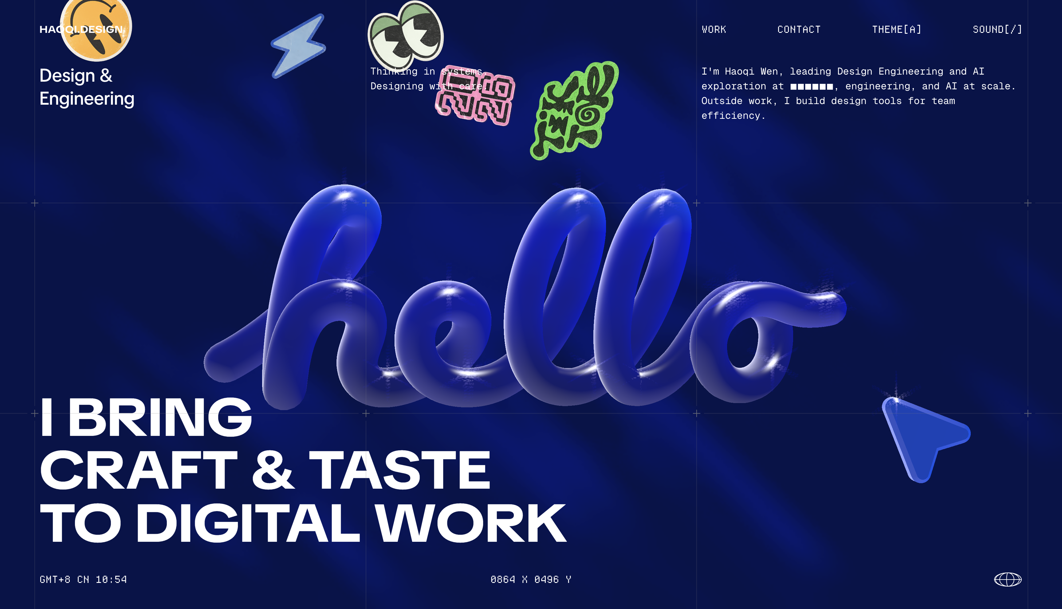
That's the detail I saved from this design engineer portfolio inspiration find. On haoqi.design, the cursor isn't a cursor. It's a paintbrush feeding a WebGL shader in real time. Every drag leaves a glowing blue light-trail on the cobalt field, and while that's happening, a small monospace readout at the bottom of the viewport ticks through your coordinate position. 0XXX X 0XXX Y. As you move your mouse the numbers change and the light follows.
I'm a sucker for interfaces that reward curiosity, and this one asks for it directly.
Why the light-trail actually works
The move only lands because the rest of the site sets it up. The hero is a full-viewport WebGL field of saturated royal cobalt (roughly #1E22C0 with brighter #3A46E6 diagonal streaks), staged inside a fixed HUD chrome: a live GMT clock top-left, the running coordinate readout bottom-center, a spinning globe glyph bottom-right, and a faint 8% white crosshair grid ruling the space. TikTok Sans handles the display type, including the inflated balloon-3D "hello" lettering that floats dead center. Tronica Mono handles all the telemetry.
The frame reads as an instrument. Which means when you move your mouse and the shader responds, the interaction slots into a mental model the page has already built for you. This is a machine. You are the input.
Most sites treat the cursor as an OS-level pointer that the design ignores until it lands on a link. Here the pointer is a first-class citizen of the scene. It has an address (the coordinate HUD). It has a paintbrush (the shader trail). And when it lands on an interactive label, it doesn't just get a color change. It gets a dashed terminal bracket around the label, like a focus reticle in a HUD.
The proof that the taste is real
None of this would matter if the rest of the design didn't cash the check the hero writes.
The whole color story is disciplined to a fault. One saturated lime-chartreuse (≈#CEFC22) is reserved for tag chips, text selection, and one tiny orbital ring in the credo section. Everywhere else is monochrome. The base is near-black #0F1111. Text steps through translucent whites at 60%, 32%, and 16%, and hairlines sit at 8% white. The single accent gets to do a lot of work because it's not competing with anything.
Motion follows the same restraint. UI transitions ride a calm deceleration curve (cubic-bezier(0,0,.2,1)); feature moments get a punchier cubic-bezier(.66,0,.01,1). Two easings running one governed system. And prefers-reduced-motion is honored on a portfolio that's basically a shader demo, which is a maturity move I want to frame.
There's a moment where the "hello" balloon-3D lettering in the hero doesn't fade out as you scroll. It disintegrates into a dot-matrix particle grid. The site treats section changes as state changes of a live scene rather than slide swaps. That's the same instinct as the cursor-paints-light move. Motion is the medium, not the garnish.
What most design engineer portfolios miss
The category default runs one of two plays. Either the portfolio performs hard and hides the work behind six seconds of scroll-jacked storytelling, or it goes so restrained the site itself becomes an argument for how boring restraint can be. Wen picked a third option. A loud homepage, silent interiors.
The homepage runs the maximal WebGL scene with the balloon lettering, the mouse trails, and a pinned hyperspace manifesto that scrubs through credo lines. The case study pages drop all of it. No WebGL, no HUD, no chrome. Just a flat #0F1111 reading column at roughly 1080px, muted white body copy, elevated #191B1B code chips inline (extractColors, rgb2oklch, getSquircle), and hairline dividers. Spectacle for the pitch, restraint for the substance.
That contract is the one I keep thinking about after the cursor trick fades. It says the team knows when to stop performing. That's rarer than the WebGL.
What I'll take from this into my own work
I'll take the idea that the pointer can be an input to the scene, not just a selector on top of it. And I'll take the discipline that funds that idea: one accent, one peak, one grid, and interior pages that go completely silent when it's time to explain the work.
The mouse-painted light-trail is the memorable move. The willingness to shut off every effect for the actual case studies is the tasteful one. Both belong in the same folder.
Want a site that makes the cursor feel like an instrument?
At Crazy Creative, we build sites where the interaction system is designed alongside the visual one, not bolted on at the end. If you're planning a portfolio, a product surface, or a landing page that needs to reward the visitor for moving through it, that's the kind of work we do. The studio lives at crazycreative.design.