

Hello, I'm Nick. I design insane websites and user interfaces.
This is where I talk about all of the cool sites I find online.
Maxima Therapy turns healthcare into a scenic road trip — and it works because every edge is rounded
The hardest brief in healthcare design goes something like this: make therapy for neurodivergent people feel warm and hopeful instead of clinical. Every default in the category works against you. Stock photos of clinicians in warmly-lit hallways. Sterile blues. Anxious urgency copy. Iconography borrowed from insurance forms. You end up looking like every other medical site because the visual vocabulary you're borrowing was built by every other medical site.
Maximatherapy.com refuses that vocabulary from the first pixel. The landing view is a cream-colored sky (~#EFEBDD) with puffy white clouds drifting through it at varied depths. A chunky orange headline in Robuck Rounded shouts, softly, "SEE LIFE FROM A DIFFERENT ANGLE" — and below it, in friendly royal blue: "We don't treat disabilities. We support differences, from birth to golden age."
Then you start scrolling, and the site turns into a road trip.
The reframe: a slogan that redirected every visual decision
"We don't treat disabilities. We support differences." That sentence is the master filter of the entire design. It's a strategist and copywriter's decision as much as a designer's, and everything visible on the site is downstream of it.
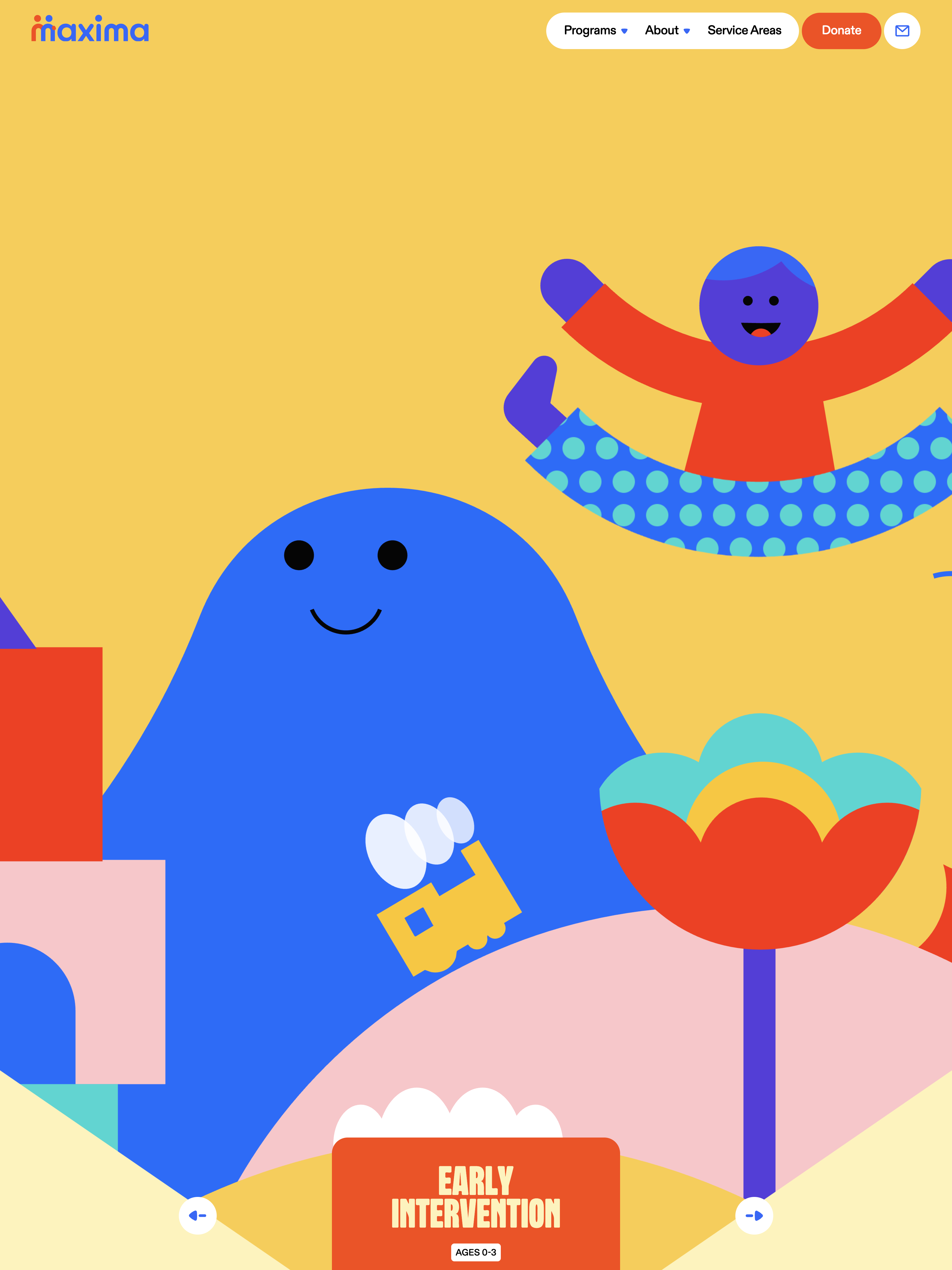
The move it enables is a hard categorical break. If you don't treat disabilities, then the site doesn't need to look like a place that treats people. It can look like a place that meets them. That's the license the copy grants, and Maxima uses every millimeter of it. There's no clinician stock photography. No sterile blue. No urgency framing. Instead you get a warm illustrated world of hills, running characters, giant pencils, and stacked books, rendered as flat geometric vector art in a joyful primary-ish palette — bright green #00B351, dark forest green, orange, royal blue, red, warm yellow, pale butter #FFF2B7, soft pink #F5CBFF. Bold fills, no gradients, no photography.
That palette isn't decorative. It's the wayfinding system. As you scroll, the background transitions scene to scene — cream, yellow, green landscape — like passing scenery on a drive.
Rounded everything as an emotional stance
Type is the first place the rounding shows up, and it does the heaviest lifting. Robuck Rounded carries display, weight 400, pushed to as much as ~257px for the hero. That's not just big — it's oversized enough that words become objects. Chunky, soft, almost hand-drawn-feeling. Colored per scene: orange in the hero, bright green in the landscape, pink and pale butter in transitions. Body and subheads sit in ABC Diatype Rounded Plus — a rounded grotesque, bold 700 for subheads at 28–40px, regular for paragraphs.
Nothing on this site has a hard edge. Not the type. Not the illustration cast. Not the pill nav. Not the rolling green hills. Not the UI buttons. That total commitment to rounded form is the site's central emotional argument: this is a gentle, safe place. When your audience may feel anxious about beginning care — parents comparing therapy providers under stress, adults navigating a diagnosis — the shape of the interface communicates safety before the copy does. Rounded type, rounded shapes, rounded UI: one unified subconscious reassurance.
It's the kind of decision that reads as obvious in hindsight and radical in practice, because most healthcare sites default to a neutral geometric sans with hard terminals and call it "clean." Maxima's choice is to spend the whole type budget on a signal — softness — and let every other element cash the check.
The scenic journey structure
The organizing metaphor of the site is a journey. Scroll is a road trip. Sections aren't sections; they're stops. Between them, the sky opens up — generous stretches of cream background with parallax clouds drifting, connective tissue that lets the design breathe.
Motion enforces the metaphor. Lenis drives smooth inertial scroll, so the pacing feels unhurried and physical. Clouds parallax at varied depths, tied to scroll progress. Background colors transition scene to scene as you enter each stop. And in the manifesto section, the words p-l-a-y / l-e-a-r-n / g-r-o-w animate vertically as kinetic value type — the brand's core promises literally moving because growth is movement.
The whole homepage runs about 12,800px of scroll. That would be exhausting on a conventional layout, but the journey framing makes the length feel like progress rather than endurance. You're not slogging through a landing page. You're covering ground.
Scroll-based routing: dissolving the boundary between pages
The most technically interesting decision on the site is what it does with URLs. The four life-stage programs — 0-3 Early Intervention, 3-18 Adaptive Skills Training, 18-65 Workforce Development, 65+ Residential Support — are separate pages, but they don't feel like separate pages. As you scroll down past the home content, the URL quietly advances into the next program page. "Next stop: ADAPTIVE SKILLS TRAINING / Explore Ages 3-18" frames the handoff in the journey vocabulary.
This is scroll-based routing — using the History API on section-enter to advance the route as the user travels through content. It dissolves the boundary between pages into one continuous experience. Combined with per-scene background colors, each life stage becomes its own chapter with its own visual identity, but you never have to click "next" or navigate a menu. You just keep going, and the site keeps updating around you.
It's an elegant, unusual choice. The trade-off is real — bookmarking, deep-linking, and back-button behavior become subtler, and a user can lose track of where they physically are. The review flags this as a place where the site would benefit from clearer orientation cues. But the intent — making the four programs feel like consecutive life stages rather than four separate marketing pages — is a genuinely humane architectural choice. Human information architecture: organized by ages of life, not by service SKU.
The illustration system as the primary medium
Maxima uses no photography. Everything communicating "what therapy looks like" is carried by a bold, flat, geometric vector illustration system. The recurring cast includes a running child character (yellow shirt, red pants, blue cap, round orange face), a giant hand holding a pencil, stacked books, speech bubbles, rounded green hills, white puffy clouds, geometric angled landscape and road shapes.
The reference point that comes to mind is "corporate Memphis" — the flat vector illustration style that swept SaaS marketing in the late 2010s. Maxima's work is a warmer, chunkier, better-drawn cousin of it. The characters have specificity. The scenes compose. The illustration system is proprietary enough that it feels like a place, not a stock library.
The choice to skip photography is doing hard work. Photos of real therapy sessions carry authenticity but also carry the visual signals of medical settings — clinical lighting, exam tables, waiting rooms — that Maxima's whole brand is trying to escape. Illustration lets the site depict care and play without cashing any of the emotional debt that photography would.
The trade-off, honestly, is representational specificity. Flat characters can't convey the concrete texture of what services actually look like the way that consented, well-directed photography could. For a trust-critical category, that's a real cost. Maxima is betting that the emotional register of the illustration outweighs the specificity of the photograph, and given the brand promise, the bet reads as right.
The nonprofit tell
Two visible details mark this as a mission-driven organization rather than a private-equity-backed care roll-up. First, the pill nav's right side carries a solid orange Donate button. Second, the copy consistently leads with values ("we don't treat disabilities…") rather than outcomes or savings. The presence of Donate in the primary nav signals that the brand is the differentiation — this is an organization whose purpose is its market position.
That framing lets the site do things a commercial care provider couldn't. Donate CTAs let it push emotional stakes without softening them into upsells. Life-stage architecture (birth to golden age) reflects the actual span of the organization's real service, not a marketing conceit. The tone can commit to warmth without needing to convert.
Where the site takes on trade-offs it hasn't fully resolved
The review lands Maxima at 7/10 on the Crazy scale — emotionally intelligent and genuinely distinctive for its category, though technically modest (Tailwind + Lenis, conventional structure beneath the illustration). The trade-offs are worth naming.
Delight vs. information density. The enormous type and generous scenic space mean relatively little information per screen. A caregiver urgently comparing therapy providers has to scroll a long way to gather specifics.
Playfulness vs. gravity of the subject. Disability and neurodivergence are serious, and sometimes the moment a family visits this site is a hard one. A relentlessly upbeat, cheerful register risks under-serving those visitors, who may want directness and clinical credibility more than warmth.
Motion vs. sensory sensitivity. This is the sharpest one. The audience explicitly includes sensory-sensitive individuals. The motion is calm — Lenis smooth scroll, gentle cloud parallax, subtle Tailwind hover transitions at 0.15s cubic-bezier(0.4,0,0.2,1), ~13 canvas animations — but the review notes no obvious `prefers-reduced-motion` accommodation or low-stimulation mode. For a brand whose inclusivity claim is central, a visible reduced-motion path (freeze parallax, disable scene transitions, static illustrations) would meaningfully strengthen the argument.
Scroll-based routing vs. orientation. Elegant, but back-button and deep-link behavior become subtler. Users can lose their place.
Heavy custom illustration vs. maintainability. A bespoke illustration-per-scene system is beautiful but costly to extend consistently as programs and content evolve.
None of these break the site. But they're the places where the brand's emotional resonance runs slightly ahead of the pragmatic needs of visitors under stress.
The core lesson: empathy as design input
What I keep returning to is the guiding question the team seems to have asked at every fork: how will an anxious parent feel here? Not "how will this convert?" Not "how will this look in a portfolio?" How will the person on the other end of this decision feel when they land on this page? The answer to that question is what determined the sky, the rounding, the illustration, the journey, and the tone of every sentence.
That's the transferable move. Empathy as the primary design input, backed by strong illustration and brand craft. When the audience is entering a category under emotional load, the best differentiation is warmth executed with conviction — and the visual system needs to be coherent enough that the warmth reads as intent rather than accident.
A few patterns to steal:
Reframe a clinical or intimidating category emotionally. The strongest differentiation in a cold category is warmth executed with commitment.
Commit fully to rounded form as a safety signal. When your audience may feel anxious, rounding everything — type, shapes, UI — is a coherent subconscious reassurance.
Build a proprietary illustration system instead of buying stock. Bold, flat, consistent characters create ownable warmth and dodge the sterility of stock photography.
Structure a long page as a scenic journey. Per-scene color transitions turn scrolling into travel and make length feel like progress, not endurance.
Map information architecture to human reality, not service SKUs. Organizing by life stage (birth to golden age) is more intuitive and more emotionally resonant.
Consider scroll-based routing to dissolve page boundaries — but pair it with clear orientation cues, working deep-links, and sane back-button behavior.
Keep motion calm, continuous, and opt-out-able. Smooth scroll and gentle parallax build a spacious, safe feeling — and a visible reduced-motion or low-stimulation mode makes the inclusivity real.
Maxima's core instinct — that people facing something hard deserve to be met with beauty and hope — is executed with rare conviction. That's a rarer thing in this category than a lot of designers realize, and it's worth studying whenever a brief lands in front of you that asks for warmth in a place that usually settles for competence.