
Hello, I'm Nick. I design insane websites and user interfaces.
This is where I talk about all of the cool sites I find online.
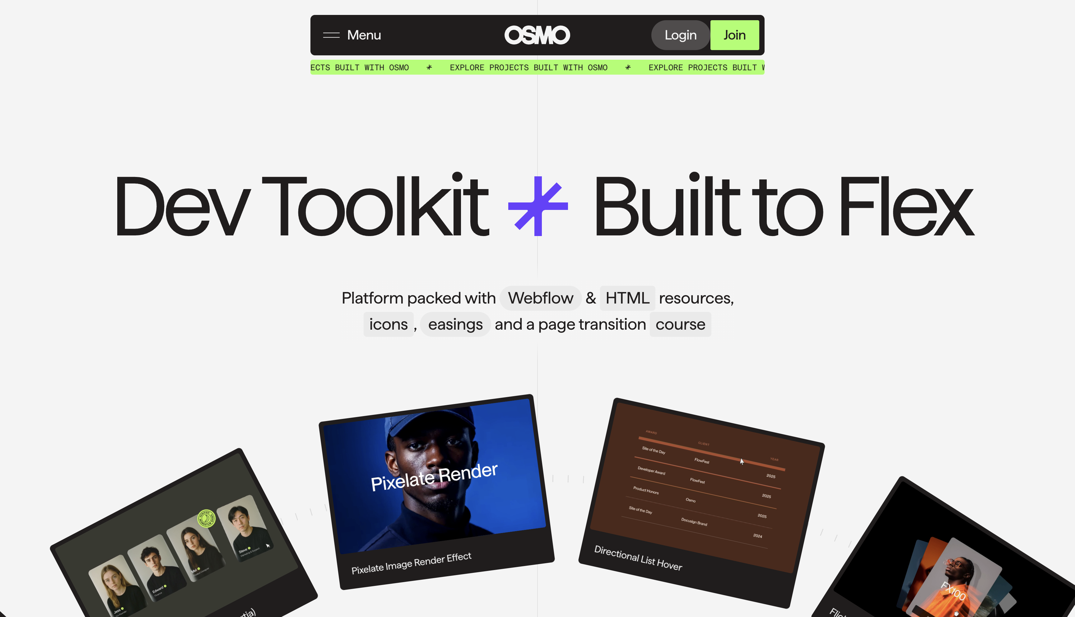
I've been staring at Osmo for way too long. It's not the giant rotating arc or the mega menu that keeps me coming back. It's the tick marks. Small hairline notches doing a move that only makes sense once you understand what design system consistency actually costs.
Those little ruler-notch marks fanning out around the hero. I noticed them, thought "cute detail," moved on, and then twenty seconds later saw them again, doing an entirely different job.
That's the move, and it's what's stuck in my head.
The decoration
The hero at osmo.supply carries a 2726×2726px disc that rotates on a 90-second linear loop. Cards ride the rim, counter-rotated so each one reads straight up. Once it settles into that cruise, the whole thing barely registers as animating. That's the point. Ninety seconds is long enough that motion becomes weather.
Draped around the disc's rim: hairlines. Faint radial ticks at --stroke-weight: 1px. Nothing about them reads like data-viz axis marks. Closer to the graduations on a compass ring, or the fine notches on a jeweler's loupe. Barely there. Almost decoration.
Except then you scroll.
The trick
Further down the page there's a latest-updates module shaped like an elongated capsule (which, yes, is also the logo, but that's a different article). It stacks news items and lets you page through them. When your cursor sits in the top half of the capsule, it becomes an up arrow. Bottom half, down arrow. Zone-split hit area, custom cursor doing the affordance work instead of visible buttons.
That capsule has a rail of hairlines running along one edge, in the exact same 1px weight as the ones on the hero disc.
Except this time one of the ticks is highlighted, and it moves when you click.
The decoration became the UI.
Why this lands
Most sites treat decoration and interface as two separate wardrobes. The ornaments live in one file. The controls live in another. They rarely rhyme.
Osmo picked one hairline vocabulary and let it do double duty. Radial ticks around a hero disc as pure texture. The same ticks on the latest-updates capsule as an active-state indicator. In one place they're wallpaper. In the other they're the interface.
Once you see it, you can't un-see it. The site stops reading as "styled" and starts reading as "designed by a team that made one rule and stuck to it."
The whole geometry system does this. The logo's elongated capsule reappears as the hero disc's implied circle, the latest-updates card shell, the platform-preview backdrop, the community-map widget. One shape, six jobs. The ticks are just the smallest expression of the same discipline.
The real cost of design system consistency
You do not need to build a 2726px rotating disc to use this move. You need one primitive you commit to. A shape, a line weight, a mark, an aspect ratio. Then you need to hold your nerve when the boring parts show up (pagination indicators, empty states, hover affordances) and use that same primitive instead of importing whatever your component library ships by default.
The reason this feels rare is that most teams tap out at the third or fourth reuse. The nav needs a divider, so a divider drops in. The stepper needs a dot, so a dot drops in. Each choice is defensible on its own. Stacked up, they read as a pile of unrelated decisions and the site stops feeling like a system.
Osmo's refusal to do that is the whole point. The active-state tick on the latest-updates capsule is the same tick that decorates the hero, because the team knew there was no reason it shouldn't be.
What I'm taking from this
A brand vocabulary is worth roughly what a team is willing to spend on the least glamorous places it could show up. The hero is the easy part. Nobody skips the hero.
The interesting question is whether the same design language shows up on the pagination indicator on the news module three folds down the page. On osmo.supply, it does. That is why I saved it.
Want a site that carries the brand this hard?
Most sites go bland the moment they try to scale one idea across a whole page. Crazy Creative builds the boring parts to match the loud ones: pagination indicators, empty states, the tenth section holding the line as hard as the first. If you want a site where the smallest details rhyme with the biggest ones, the studio lives at crazycreative.design.