

Hello, I'm Nick. I design insane websites and user interfaces.
This is where I talk about all of the cool sites I find online.
I keep going back to Sendr.ai for one reason. Twenty words of customer testimonial that appear one at a time across nearly a full viewport of scroll, set in a serif that shows up nowhere else on the site. Everything above and below that passage is deliberately, almost obstinately still. That single moving sentence carries the entire motion budget of the page, and it works.
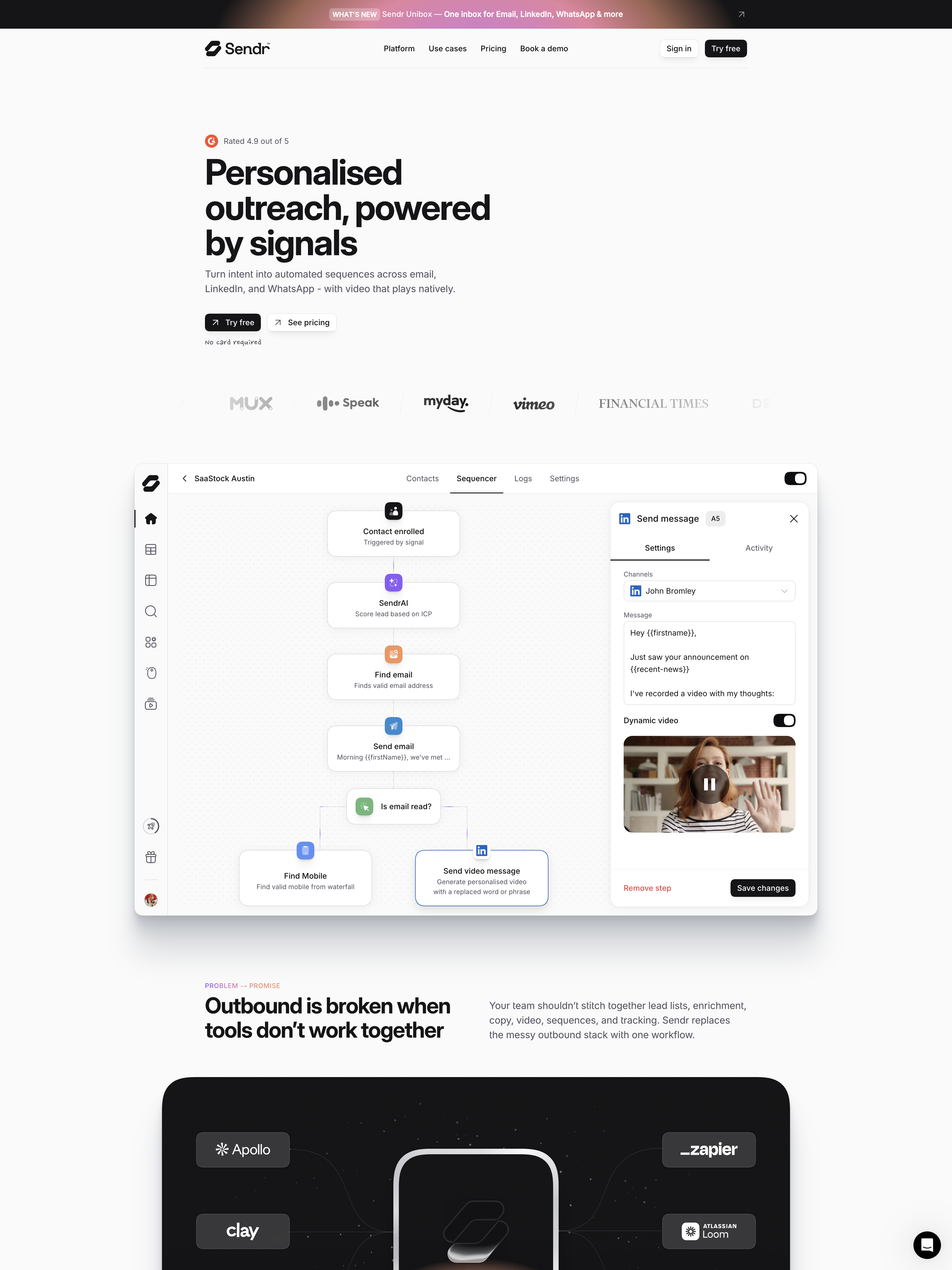
Sendr.ai is a Framer-built outbound-sales SaaS site, and if you scroll it end to end without paying attention you might miss what makes it different. It is quiet in a way B2B software marketing usually is not. Somewhere around the halfway mark of the 15,472-pixel page you hit a field of dot paper, a Financial Times quote in Hedvig Letters Serif at 60px, and the words start illuminating left to right as you scroll. It is the only choreographed moment on the entire homepage.
The one scroll-linked animation on Sendr.ai
Here is the move, mechanically. The quote is split into 20 word-level spans. As you scroll from roughly y=7550 to y=8480 (about 930 pixels, almost exactly one viewport height at 1440x900), each word animates from opacity 0.1 to 1. That works out to about 46 pixels of scroll per word. Color never changes. The type never moves. It is the leanest scroll-linked animation you could reasonably ship, and it is the whole event.
The serif is doing a lot of the work. Hedvig Letters Serif 400 at 60px with −1px tracking against a page built entirely on Inter is a real shift of register. It sounds different than the rest of the site sounds. The surface underneath it is the coarsest of three dot-paper tunings the site uses, a 16px lattice at rgba(0,0,0,0.08), noticeably heavier than the 12px and 14px versions elsewhere. There is no card, no border, no shadow, and zero chroma. Everything about this section is calibrated to feel like an epigraph in a book you paid for, not a testimonial slide in a deck.
One caution the review flagged that I want to pass on. The effect only fires on genuine wheel input. Any programmatic scroll (or an anchor jump into the middle of the page) skips the reveal and lands on a fully illuminated quote. A better implementation would bind the sweep to scroll progress rather than wheel deltas so the moment survives a jump.
Everything they refused to spend the motion budget on
To feel why this lands I had to catalog what Sendr did not do:
No load choreography. At 400ms the hero is complete and static.
No page transitions. Route changes leave the main element at opacity 1 and transform none.
No entrance reveals on any section. The stats row of 5M+, 3.1x, 2.5hrs, 12k does not count up. Product screenshots do not fade in. Card grids do not stagger.
The entire hover vocabulary is three color swaps. Dark buttons go from #151517 to #262629. Light buttons go from #FFFFFF to #FAFAFA. Nav links paint an #F2F2F2 pill with transition-duration 0s so it snaps.
Product cards lift exactly one pixel on hover. translateY(-1px). That is the full extent of the response.
The only authored :hover rule in the entire stylesheet is one that removes an inherited transform.
The site authors exactly two transitions across the whole homepage. Both use cubic-bezier(0.22, 1, 0.36, 1). One runs 220ms, the other 200ms, and the 200ms variant only appears inside the hand-coded pricing widget. You can locate the exact boundary between "built in Framer" and "written by an engineer" by reading a 20-millisecond difference.
This is a company that spent almost none of its motion budget so that spending it once could count.
Why the one moving passage feels like an event
Most scroll-linked animation I watch other B2B sites ship is competing with every other animated thing on the same page. Fade-in headlines. Stagger-in feature cards. Numbers that count up. Product screenshots that ease into view. All of it good technique. None of it individually memorable, because there are twelve of it happening.
Sendr's serif quote is legible as a decision because the rest of the page holds still. If the stats row also counted up, if the cards also lifted three pixels, if the hero also faded from below, this section would be one more animated moment in a page full of them. Instead it is the moment. The site earns the drama by refusing it everywhere else.
There is one honest tradeoff worth naming. The 2x2 product-card grid in the middle of the page invites exploration and responds with a one-pixel lift, which is below the perceptual threshold. On affordances that explicitly promise depth, the restraint edges toward under-response. A team this disciplined could have decided which specific components deserved a stronger hand and given the cards a real hover state without breaking the system. That is what I would fix. But it is a component-level oversight sitting against a system-level conviction that is otherwise beautifully consistent.
The rule I keep
You get one animated event per page. Everything else is state changes and stillness. Then you have to pick the right sentence, the right image, the right moment for the one event. Sendr picked a customer quote and lit it word by word in a serif nobody else on the site got to use. That is a design decision I want to be more disciplined about making.
Working on a site that needs to know when to hold still?
The hardest part of designing motion is figuring out what not to animate. If you are building something where every section is trying to earn attention with the same reveal, you already know the fatigue. At Crazy Creative we build sites that pick one moment and mean it, and treat the rest of the page as the surface that makes the moment legible. Come see what we have built at crazycreative.design.