

Hello, I'm Nick. I design insane websites and user interfaces.
This is where I talk about all of the cool sites I find online.
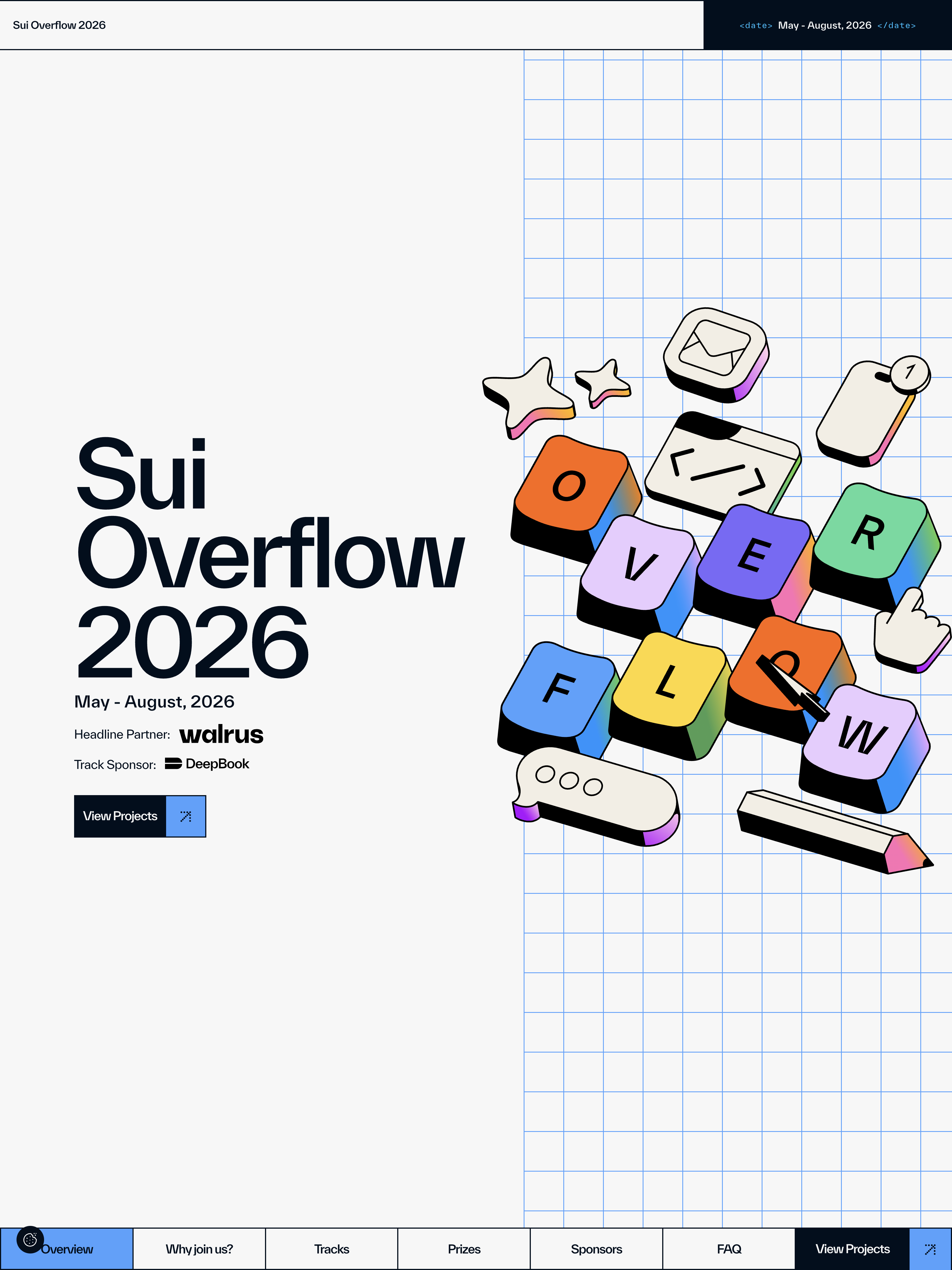
Somewhere between opening a hackathon landing page and closing it, I usually stop noticing. Not this one. The Sui Overflow 2026 site opens with a fake operating-system boot window that scales up and becomes the hero, and I've been thinking about it for two days.
The site is Sui Overflow 2026, the marketing page for Sui's global hackathon. Its opening move is unlike any preloader I've seen used in production. A 720×560 window sits centered on a field of blue graph paper. The title bar reads May - August, 2026 in a monospace font. A discrete progress track fills cell by cell. INITIALIZING... counts from 0% to 100% over about two seconds. Then, at roughly 3.2 seconds in, a purple tile slides across the status bar like a playhead, clipping the label so only ZING... remains. The window body empties. And then the window scales up to fill the viewport, and the hero content is revealed inside it. For another beat you can still see the window's dark border ring and a sliver of title bar at the top edge.
The site doesn't dismiss its loader. It opens it.
Why this stopped me
Most loaders are apology tokens. They're the interface a site shows while its real interface renders, and the user's job is to endure them. The best ones get out of the way fast. Sui Overflow's does the opposite. It uses the load itself to state the entire brand thesis before a single word of copy is read: this is a tool, built by developers, for developers, and the marketing site is going to feel like the tools you already live in.
Once you notice, the whole page rearranges around it. The graph paper is the ground plane the boot window sat on. The tags echo the same wrapper the title bar used. The bottom section nav that pins to the viewport for the whole scroll session is part of the application window you booted into. You spend the rest of the page implicitly inside a running program.
That's a hell of a premise to sell in three seconds. Most sites can't sell it in three thousand words.
The rest of the site earns it
Concepts of this kind fall apart when the rest of the site fails to hold them up. This one holds. Every button, badge and tile on the page returns border-radius: 0 and box-shadow: none. That's the rule that keeps the flat color blocks reading as UI panels instead of stickers. One easing curve does everything: cubic-bezier(0.525, 0, 0, 1) at 0.525s. Same number twice, which reads as a single person deciding this once and never revisiting it. Type is a single family, TWK Everett, running from a 140px hero headline at −7px letter-spacing down to 12px monospace eyebrows, with the personality coming from the range rather than from a second face.
Then there's the bottom nav, which is where the color system tips its hand. Seven segments pinned to the bottom of the viewport. Each authored its own hue. Overview blue #4da2ff, Why join us? yellow #ffd731, Tracks orange #ff7a00, Prizes lilac #e9ccff, Sponsors green #55db9c, FAQ purple #5c4ade, View Projects bone #f2eee4. Hover a segment and it previews its section's color. Scroll to the section and the same hue lights up on arrival. The nav is a color legend for the page you're standing in. Every section then applies its assigned hue to the card fills and the badge chips, so a color is never allowed to wander into a section it doesn't own.
The prize badges are the smallest, cleverest expression of the whole thesis. They're shaped like # 1st place }. A green chip holds #, a colored chip holds the label, a third chip holds }. It's a CSS-selector-shaped badge. Syntax used as ornament, costs nothing to ship, unmistakably for developers.
What I'll take from this into my own work
Two things stuck.
First: the loader can do work. I've defaulted to treating page-load choreography as a technical necessity to be minimized. Sui Overflow proved I've been undervaluing it. If your first three seconds establish the whole concept, the rest of the site can afford to be quieter. Their motion budget is spent almost entirely before the fold, and the discipline past the fold is what makes the opening feel intentional rather than showy.
Second: color as an organizing device is dramatically stronger than color as an accent. When one hue owns every visual element in a section, and the site's nav teaches you the assignment as you use it, the page reads as one coherent object even when the sections have nothing else in common. That's a system I've been underusing. I have a client project on my desk right now where I'm going to try it.
The site has flaws worth naming. Five Lottie animations on the track cards were built, mounted, and left paused at frame 0. An entire 24-track events marquee sits inside a display: none wrapper. The intro locks your scroll for around 5.5 seconds and the cookie bar re-locks it for another few. I noticed. I also don't care that much. The opening move is worth the friction.
Want a hackathon landing page that opens like this?
If you're building a launch page and it's supposed to feel like a tool rather than a brochure, this is the kind of thinking we bring at Crazy Creative. Concept-driven load sequences, systems that hold across every card and badge and hairline, color that teaches itself as you scroll. Motion that earns its keep. See what we've built at crazycreative.design.