

Hello, I'm Nick. I design insane websites and user interfaces.
This is where I talk about all of the cool sites I find online.
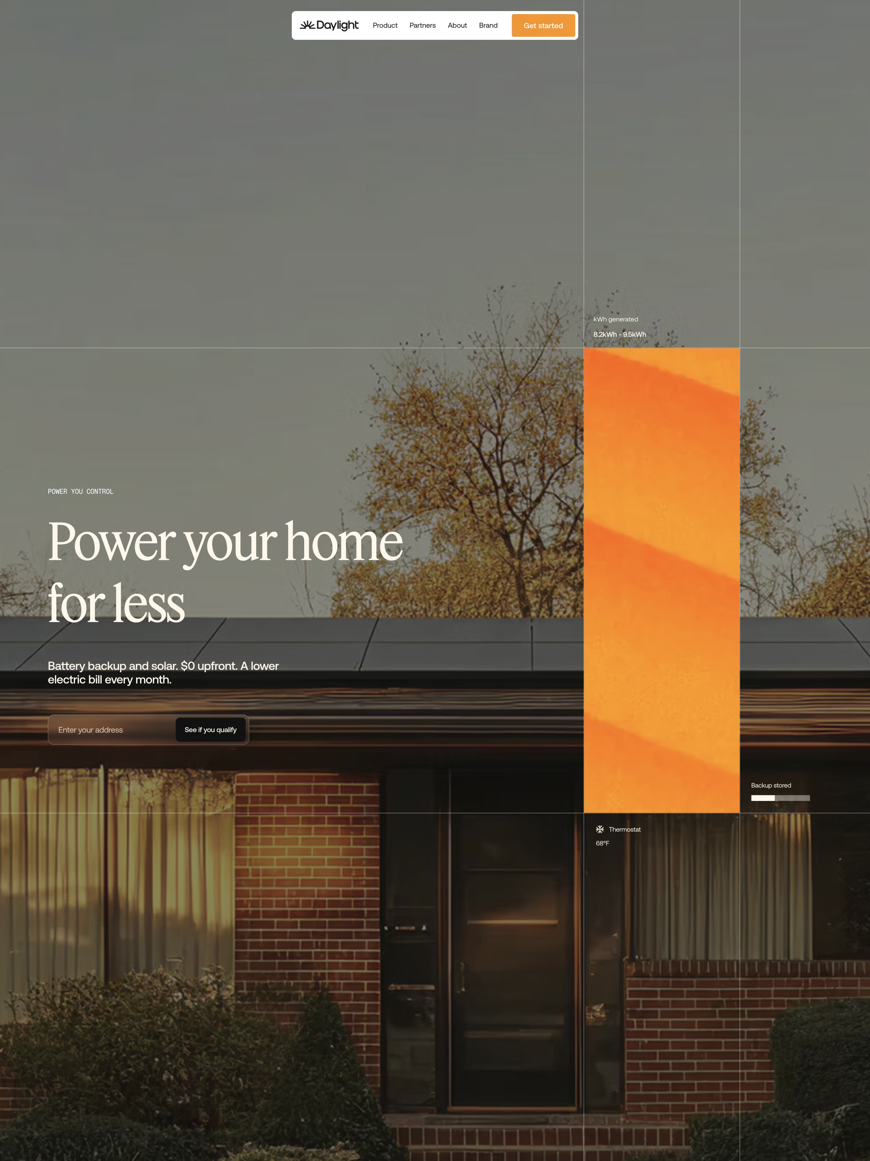
I've been staring at Daylight for two days now, and it's because of one move that's rewired how I think about editorial web design. The grainy orange wave that loads the page is the same object that becomes the hero's live-data tile, and it's the same object that wipes across the screen when you click through to another page. One canvas element, three roles, zero waste.
Most sites treat the preloader as something to hide from. Daylight refused. They built one signature texture, a 2D-canvas render of drifting diagonal wave-bands with film grain looping at roughly 2s, and they made it earn its keep across the entire experience.
The economy that gives this site its confidence
Here's the sequence, in the order you actually see it. The page opens on a full-viewport orange grain-wave with a spinning sunrise mark and a letter-by-letter "Daylight" wordmark reveal. It holds for about a second. Then, instead of fading out, it contracts. The whole curtain scales down and clips itself into the right-rail tile of the hero, where it keeps drifting quietly as ambient "captured sunlight." Later, you click through to another route and the same wave sweeps up to cover the screen (this time in dusk purple, or gold on Product), reveals the next page, and disappears again.
I can count on one hand the number of production sites I've seen pull this off without it feeling like a party trick. The reason Daylight nails it is discipline. There is not a single CSS gradient on the site. Every orange or purple surface, the loader and the tiles and the footer and the page wipe, is drawn on canvas. The team decided the wave was the brand, and they made every "brand moment" the same object.
One ease governs everything
The other thing I keep coming back to is how coherent the motion feels. Big reveals like the curtain contracting, the tiles surfacing, and headlines rising into view all run the same easing: cubic-bezier(0.16, 1.08, 0.38, 0.98) at roughly one second. That 1.08 control-point gives everything a barely-there settle, never a bounce. Fast fades on nav links use cubic-bezier(0.4, 0, 0.2, 1) at 0.15s. Two curves, and that's the whole vocabulary.
You feel this even if you don't know what to call it. The whole site decelerates, and nothing arrives abruptly.
Editorial web design that lets the palette carry the argument
The color story on Daylight is doing narrative work. The palette is a full day's sky in scroll form. Dawn orange (#F66F00) opens the hero. Warm sand (~#ECE2CE) holds the pinned three-step explainer. The dark chapter drops to #111. A golden sunset aerial resolves it, a periwinkle #C8B2FF "step into Daylight" finale pays it off, and a vivid orange (~#FA3C00) footer signs off with "More Power."
That palette isn't decoration. It's the argument. The site is telling you "we power your home from sun-up to blackout" by literally being the arc of a day. Interior pages inherit the exact same layout grammar and swap only the accent (gold on Product, navy on About). Consistency as system.
The one honest tradeoff
If I'm being fair, a few of the cream-on-golden-hour-photo passages get faint, and some of the mono data labels on the hero tiles read at the low end of legibility. A subtle scrim under a couple of headlines would fix it, and that's genuinely the only thing on the whole site that isn't sitting at a 9. Even the tradeoff feels chosen, because mood came first, and mood is what this brand is selling.
What I'm taking from this into my own work
Two lessons, in plain terms. First, if your brand has a signature visual, make it work harder than a hero image. Make it be the loader, the tile, the transition, and the frame. Fewer objects doing more will always read as more confident than more objects doing less. Second, pick one easing curve and hold it. Motion coherence isn't a technical detail. It's the thing that separates a website that was built from a website that was authored.
Daylight is going in the inspiration folder. Probably permanently.
Want a site that behaves like itself?
The reason Daylight feels authored is that a small team obsessed over one idea and refused to let it be decoration. That kind of coherence is what we build at Crazy Creative: brand systems that behave like themselves, one signature object doing the work of ten, motion allocated on purpose. If you're building something that has to feel like this, the studio lives at crazycreative.design.