
Hello, I'm Nick. I design insane websites and user interfaces.
This is where I talk about all of the cool sites I find online.
Tines dresses enterprise automation in an editorial serif — and it works
Most B2B security sites look like a terminal. Dark backgrounds, geometric sans-serifs, monospace runoff, a lot of gradient blue. The subtext is always the same: we are engineers, this is serious. Tines opened a browser tab at tines.com and made me question every assumption I've had about how workflow automation is supposed to present itself.
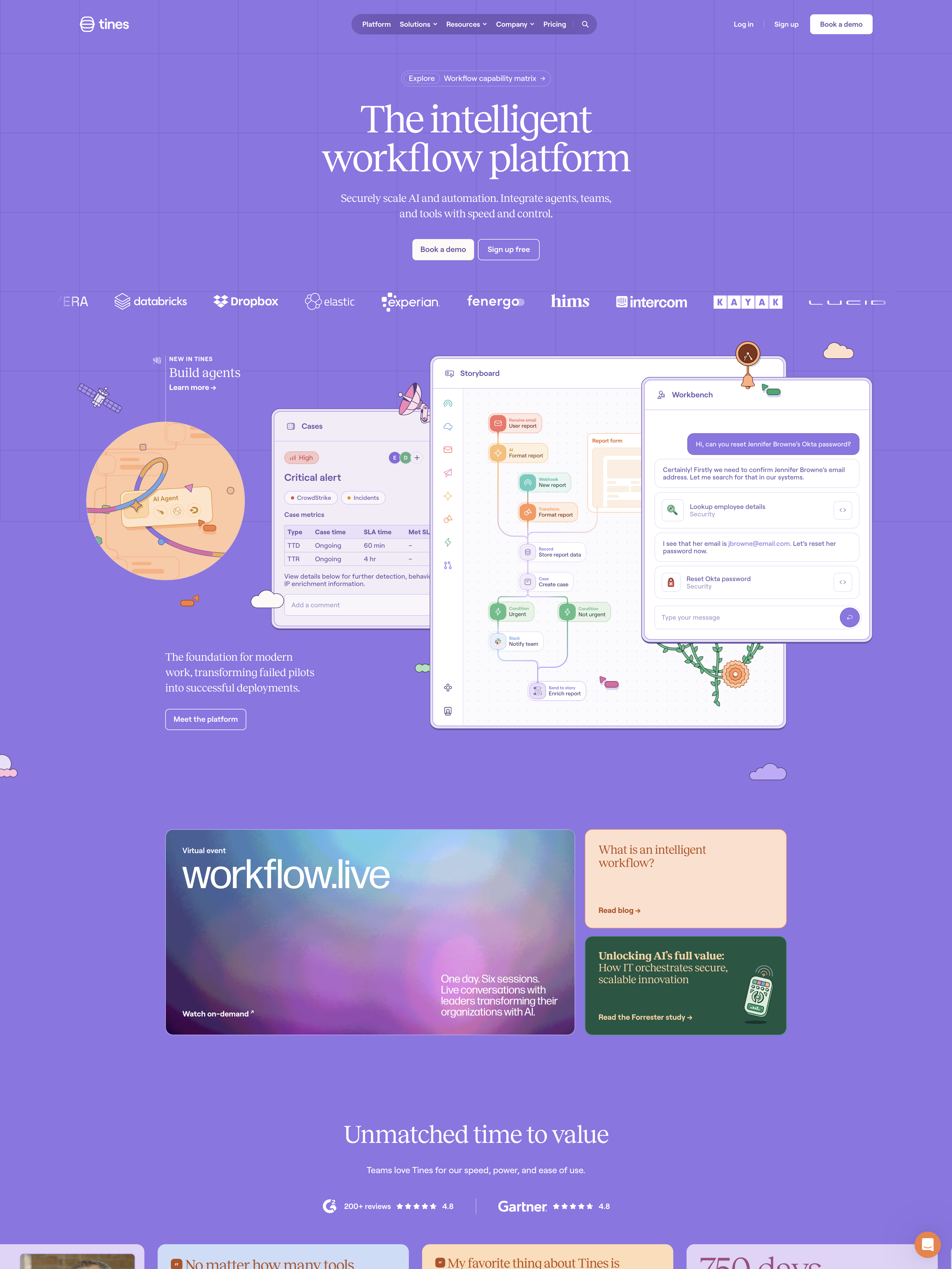
The homepage is a single saturated periwinkle-purple world — one hue (~#7B6EF6 family) treated as the environment, not an accent. Against that field, the display type is set in Reckless, a high-contrast editorial serif that would feel more at home on a luxury magazine cover than a security-orchestration platform. The hero headline runs at 72px, weight 400: "The intelligent workflow platform." Two lines. Enormous breathing room. That's the pitch. That's the whole above-the-fold argument.
I stared at it for a while. It shouldn't work — and it does.
The bet: taste as a positioning weapon
Tines sells to security and IT operations buyers. That audience is trained to distrust marketing. They read specs. They want to see architecture. They know what a webhook looks like. Everything about the conventional playbook says: don't try to be pretty, be credible.
Tines takes the opposite bet. Every typographic and color decision on the site pushes away from "hacker tool" toward "considered product." The result is a design that reads as literate rather than technical — a signal that the company understands its own work well enough to talk about it calmly. In a category that competes on urgency, Tines competes on composure.
The specifics carry the argument. Reckless for headlines. Roobert — a warm rounded grotesque — for body, nav, buttons, labels. Uppercase letter-spaced eyebrows at 10–12px in weight 600–700. A single saturated purple field with white type. A small warm counterpoint palette of peach, cream, sage, and deep plum reserved for editorial cards and category color-coding. That's the entire visible system, and it's held with discipline across ~9,150px of scroll.
The move Tines pulls off is committing to a color as a world. Purple isn't the accent. Purple is the room you're standing in. Everything else — the warm pastel cards, the product-UI stages, the marquees — is furniture inside that room. When you decide to live in one hue that hard, it stops feeling like a brand color and starts feeling like a place.
The signature: product UI as hero art
Halfway through the homepage, Tines shows you three product surfaces: Cases, Storyboard, and Workbench. This is the persuasion engine of the site, and it's built on a choice I hadn't seen executed this well before.
Instead of abstract illustration — the vector arrows and gradient meshes that most SaaS uses to talk about "workflows" — Tines renders actual product interface as first-class hero imagery. Not screenshots. Not marketing renders. Believable product chrome doing specific, named tasks. A critical CrowdStrike alert in the Cases panel with SLA metrics and enrichment notes. A workflow builder in Storyboard. A Workbench copilot walking through a live Okta password-reset conversation.
The interfaces breathe. Idle animations keep the surfaces alive — approximately 52 concurrent infinite animations run on the page at load, with the product mockups drawing much of that budget. It's demo theater, technically. The site is a static Gatsby build (v5.14.5) with choreographed CSS animations, not a live embed of the actual app. A sophisticated visitor will register the gap between the staged surface and the real product. But the choice is right. Showing beats telling for technical buyers, and staging the show with this much intention is more honest than "abstract diagram of pipes."
The lesson generalizes: when the product does something visible, the product should be the art direction. Illustration is a tax you pay when the software is hard to photograph.
Motion that reassures instead of performing
Enterprise sites usually get motion wrong in one of two directions. Either they treat it as forbidden (nothing moves, everything feels dead) or they treat it as a way to look modern (aggressive parallax, GSAP scroll-jacking, cinematic transitions that block the user).
Tines picks a third path: motion as aliveness, never spectacle. The timing budget is 0.1–0.5 seconds. Hover transitions run at 0.25s on ease, property all — subtle lift, subtle tint. Fast micro-fades sit at 0.1s opacity. The signature reveal easing is cubic-bezier(0.075, 0.82, 0.165, 1) — ease-out-circ — at ~0.5s, paired with a 0.2s opacity handoff. Nothing jerks. Nothing waits for the user. Sections settle into place as they enter the viewport.
There's no scroll-jacking, no Lenis smooth scroll, no bespoke WebGL. The stack is deliberately restrained. And yet the page feels awake — because of those ~52 slow ambient loops running underneath. Testimonial marquees drift horizontally. Product surfaces breathe. Because the color world is so unified, that motion doesn't read as chaos — it reads as life.
The single technical gap the review flags is real: no prefers-reduced-motion accommodation was detected. For a brand this considered, and for an audience that includes federal and enterprise-accessibility mandates, running 52 infinite animations without honoring the reduced-motion query is a rough edge. It's the one place where the site's brand-first instincts outrun its rigor.
Design as information architecture
The section I keep thinking about is the work taxonomy — a three-panel color-coded triptych mapping "Human-led / Deterministic / Agentic" modes of work to "Best for" lists. Sage for Human-led. Purple for Deterministic. Peach for Agentic. Overlapping rounded panels, arranged for depth.
This is the site's clearest expression of a principle worth stealing: color as comprehension, not decoration. Explaining "agentic vs deterministic vs human-led workflows" in copy alone would take three careful paragraphs. Encoding it as a color system lets the reader self-locate in seconds. The visual system is doing cognitive work — carrying meaning that would otherwise sit in prose.
That's the difference between design that illustrates strategy and design that is the strategy. Tines runs a bunch of these small acts of information design across the page — the marquee proof cards, the category coding, the resource-tile eyebrow system — and each of them makes complex content faster to metabolize.
What Tines gets away with, and why
The Crazy Score on the review sits at 6/10, and that feels right. Tines isn't technically extreme. There's no scroll-jacking, no bespoke WebGL, no cursor play, no exotic transitions. The layout grammar is familiar modern SaaS: centered hero, alternating feature blocks, card grids, social-proof marquee, resource tiles, deep multi-column footer. Nothing structural would surprise a designer who's looked at a hundred other B2B homepages this quarter.
What makes Tines distinctive is a decision, not a technique. The team refused their category's aesthetic defaults. Somebody with editorial or consumer sensibility — the review guesses a design leader with publishing DNA — defended a contrast serif and a single saturated color against the gravitational pull toward "safe enterprise blue," and then executed the whole page with the discipline required to hold that choice.
The trade-offs are honest and named in the review. A hands-on security engineer might want more information density above the fold — architecture, integrations, specs — sooner. Living entirely inside one hue can flatten section hierarchy; the warm pastel cards do heavy lifting as visual punctuation. Reckless is beautiful at 46–72px but gets fragile at the 20–26px subhead sizes on a saturated background. The accessibility gap on motion is real.
None of that changes the strategic move. Tines figured out that in a category where every competitor is shouting "we're serious," the fastest way to communicate seriousness is to sound calm. The design says the company has taste, which implies it has judgment, which implies the automation platform reflects the same judgment. It's a positioning weapon that hits before you read a word.
What to steal
A few patterns from this site are worth transplanting anywhere your category has an aesthetic default worth escaping:
Commit to one color as a world. Not a primary + accent + secondary. One saturated field, white type on it, a small warm counterpoint reserved for pace-changes.
Pair editorial serif with soft, slow easing.
cubic-bezier(0.075, 0.82, 0.165, 1)at ~0.5s makes elegant type feel earned rather than pretentious. Hover transitions at 0.25s.Render your product doing real tasks, not abstract ones. A named alert, a specific workflow, a believable conversation — technical buyers metabolize concrete interface faster than any illustration.
Color-code your taxonomy. If you're selling a category concept that takes paragraphs to explain, encode it visually and let the color system carry the load.
Spend whitespace like money. In trust categories, generous emptiness signals a company confident enough not to oversell.
Tines makes automation look like it has taste. That's a much stronger opening argument than any spec sheet.