

Hello, I'm Nick. I design insane websites and user interfaces.
This is where I talk about all of the cool sites I find online.
Utopia Tokyo opens with a seizure warning — and every choice that follows earns it
The first thing utopiatokyo.com shows you is a full-screen vermilion modal with a glitching headline that reads EXPERIENCE WARNING. Below it: a photosensitive-epilepsy notice and two bracketed terminal buttons — [ USE SAFE MODE ] or [ ENABLE GLITCH EFFECT ]. You have to pick.
That gate tells you everything about the site before you've seen it. This is a piece of work that treats its own intensity as a feature to be consented to, not a defect to be softened. Utopia Tokyo is an Awwwards Masterclass showcase — credited to Simon Smeraldi, Andrew Measham, and Niccolò Miranda — and it operates at a register the open web rarely tries anymore: a full commitment to worldbuilding, executed with competition-tier front-end craft. It is not a website. It is a playable dystopian film title sequence that happens to live at a URL.
The fiction: a surveillance-state Tokyo where masks are identity
The premise the site commits to is a dystopian near-future Tokyo where "the government's promise of a perfect society has become a tool of oppression." Masks are how citizens signal identity, allegiance, and resistance. That's the piece of worldbuilding. And every visual decision on the site — every coordinate readout, every version tag, every glitched frame — is subordinate to it.
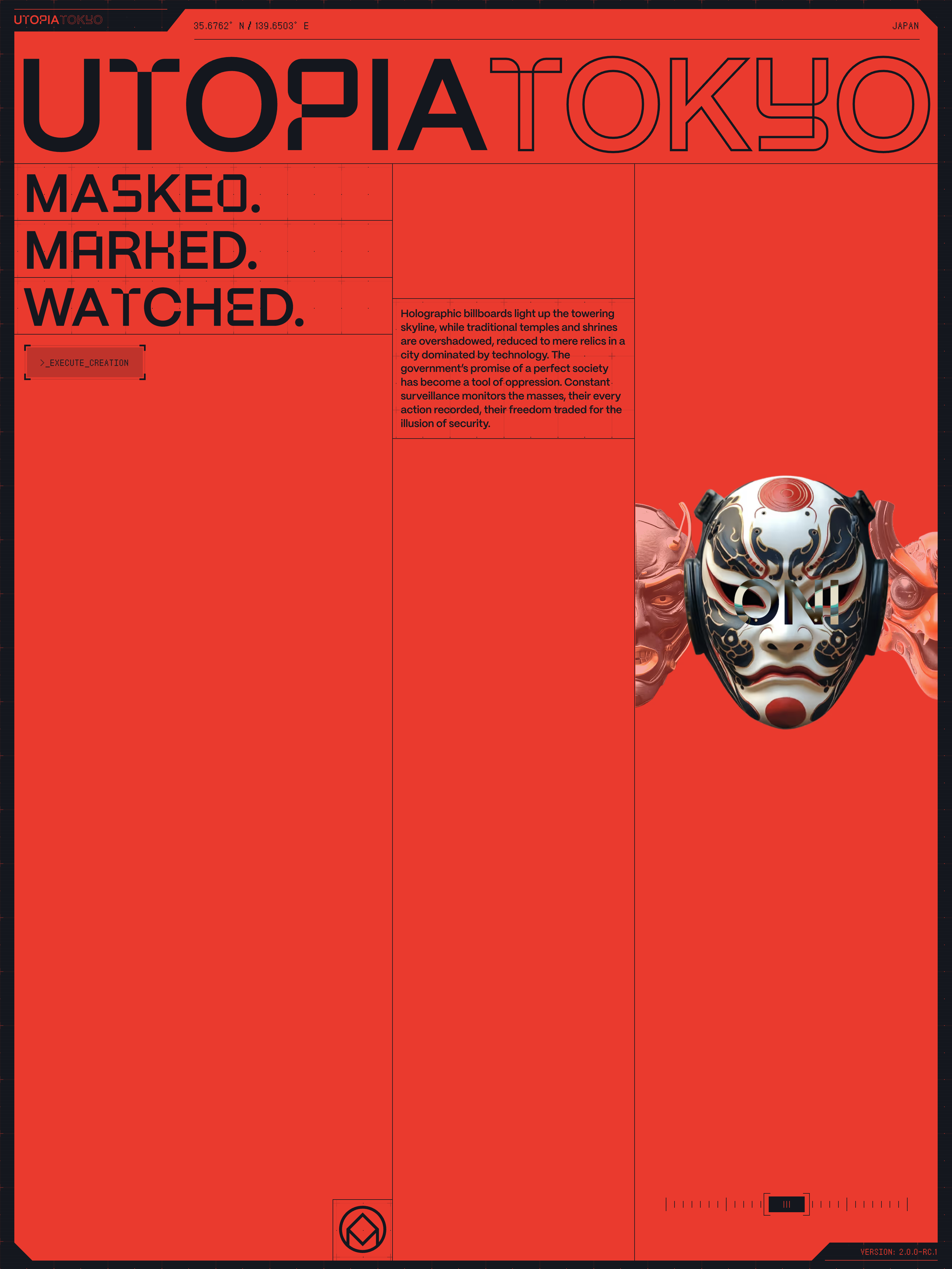
Utopia Tokyo doesn't decorate a marketing message with dystopia. It builds an actual world with actual chrome. Coordinates 35.6762°N / 139.6503°E sit in the persistent top HUD bar next to the wordmark and the label JAPAN. Terminal buttons carry commands like >_EXECUTE_CREATION. Version tags read VERSION 2.0.0-RC.1. Hash strings, block IDs, skill points, PROCESSING DATA CHUNKS. None of these are real metadata. They're diegetic props — interface that exists inside the fiction, telling the story without ever writing "the government watches you" into a paragraph. The chrome carries the narrative.
The visual system: strict enough to make chaos legible
The palette is a strict duotone: surveillance red (~#EE3B2E, with a hotter #FF1919 for HUD text) and near-black navy #14171F. That's it. No secondary color. No accent. The 3D masks contribute white/black/red kabuki and pink demon shading, but even those stay inside the red/dark world.
What the site does with those two colors is where the technique announces itself. Blocks invert. A full-bleed vermilion hero panel carries near-black type. Scroll down and the palette flips — now the section is near-black and the type and grid lines are red. This block-by-block inversion creates a strobing, high-tension rhythm that makes the whole page feel like it's under pressure.
Display type is a techno-grotesque — PP Mori / PP Neue Montreal with alternate glyphs (angular S, flat-top A, geometric G) — pushed to 190–236px in bold, with adjacent words treated differently: UTOPIA is a solid fill, TOKYO next to it is outline only. Type is cropped by the viewport edge. It's not contained. It's architecture. Kanji and katakana appear at the same display scale in outline — 理想郷 ("ideal land"), 鬼, サムライ — used as decorative vector type carrying the "past and future collide" thesis at the level of the letterforms. HUD readouts and coordinates sit in pixel/mono faces (Zpix, Neopixel). Body copy stays in PPMori.
The trick this system pulls off is making room for corruption. RGB channel-splits, scanline flicker, glitch on the 3D masks and the type — the signature motion of the site — only reads as intentional design because the baseline is so controlled. If the palette drifted, if the type family sprawled, the glitch would land as noise. Because the two-color system is strict, every deliberate break inside it becomes legible as authored decision.
The protagonists: photorealistic Spline masks
The emotional and interactive core of the site is a cast of photorealistic Japanese masks rendered in real-time Spline 3D — Samurai, Oni, Hannya, Tengu, Hyottoko, Namahage, Kitsune, Okame, Ultraman, Komainu, Animegao, Kappa, Noh, Kendo. They rotate. They glitch with RGB-split. They sit inside HUD data overlays labeled DATA_INTELLECT, DATA_SPIRIT, DATA_FEROCITY.
Then the site pulls the move that lifts it from "beautiful 3D showcase" to "coherent world": each mask carries an RPG stat sheet. Bilingual stat rows: STRENGTH 強さ, INTELLECT 知性, AGILITY 敏捷性, SPIRIT スピリット, VITALITY 活力, FEROCITY 凶暴性. LEVEL 10, SKILL POINTS 60, values, lore copy. ("The namahage mask is worn by a performer who portrays an ogre…") You're not looking at product photography. You're inspecting a character.
This is the reason the framing works. Rendering the masks in real-time 3D makes them feel alive enough that the RPG data attached to them reads as native rather than bolted on. The site invents a way of talking about cultural artifacts that treats them like game characters — respectfully, with research behind the lore — and the visual system holds up the metaphor.
Motion as choreography, not decoration
The stack under the hood is the maximalist experimental kit: Webflow structure, jQuery 3.5.1, GSAP + the Flip plugin for timeline choreography and layout morphs, Lenis for smooth inertial scroll, Barba.js for seamless SPA-style page transitions, and Spline (via spline-viewer.js) for real-time 3D. Approximately 97 concurrent animations were observed running on the page.
The team storyboards the site like a film. There's an act structure. A preloader that is a designed experience in its own right — UTOPIA/TOKYO letters positioned around a technical grid with [LOADING] markers → a red segmented progress strip → a horizontal filmstrip of mask imagery sliding in → resolve to hero. The elaborate intro exists partly to mask the heavy Spline initialization; a technical constraint is turned into a narrative and brand asset.
Barba handles route transitions so that whole type-blocks slide and wipe between pages like set pieces. Because the headlines are architectural and full-bleed, seamless page transitions can move them cinematically without breaking the illusion of a single continuous world. Nothing on this site merely appears. Everything is directed.
The play mechanics
Two moments push the site past "beautiful showcase" into something stickier. First is DISCOVER YOUR MASK — a gamified generator with RANDOM SELECTION, >_DISCOVER_YOUR_INNER_MASK, "GENERATING MASK / MASK READY," and fake data theater (HASH: 0xE5B28E, PROCESSING DATA CHUNKS, BLOCK: S-733, COMPLETION 100%, SKILL POINTS 60). It converts the visitor from a passive scroller into a participant. Second is an actual minigame teased at the credits.
The pattern is worth naming: stat sheets, generators, and minigames convert scroll depth into engagement. Play is stickier than reading. Once the site has given you a mask with numbers attached, you've been implicated in the fiction.
The catalog itself gets a GRID/LIST toggle, flip-morphed between states — the kind of micro-choreography that would be gratuitous on a normal site, but on this one just fits.
The tensions the site accepts on purpose
The review lands this piece at 9/10 on the Crazy scale, which is the highest bracket for near-complete rejection of conventional web restraint in service of an immersive concept. The trade-offs are honest and named.
Spectacle vs. accessibility. The site literally opens by admitting it can trigger seizures. Safe Mode softens the glitch effects, but the density, motion, and low-contrast-in-places design remain demanding. Accessibility is explicitly traded for impact. That's the deal.
Immersion vs. information. Actual content — what these masks are, why you'd care, why the fiction matters — is buried under worldbuilding. On a product or client site this would be fatal. On a showcase it's the point.
Load theater vs. speed. The multi-stage preloader and ~97 concurrent animations delay meaningful content by many seconds. Beautiful, but a real-world conversion killer.
3D richness vs. performance. Spline masks are gorgeous on capable hardware and tax lower-end devices unevenly. The experience degrades unpredictably at the edges.
Concept-completeness vs. reusability. Almost nothing here transfers wholesale. The design is so fused to its fiction that its value is as a technique library and an ambition benchmark, not a template. That's fine — this isn't trying to be a template.
What the site is actually for
Utopia Tokyo isn't trying to sell you anything. It exists to demonstrate what the medium can do — to move an audience of designers and judges, and to serve as a masterclass artifact. Read that way, every choice makes sense. The seizure warning is not a legal hedge; it's a refusal to soften the vision. The heavy Spline load is not a bug; it's a demonstration of a technique. The RPG stat sheets aren't cute; they're a systems-design argument about how to make cultural material feel navigable at web scale.
What to steal, carefully
Not much of this transplants directly to a normal client site. But a few patterns generalize.
Let users consent to intensity. A tasteful safe-mode/full-experience gate lets you ship bold motion without abandoning accessible visitors. Intensity becomes an opt-in feature.
Build a world, not a page. Coordinates, version tags, HUD readouts, consistent lore — diegetic interface chrome carries story more efficiently than copy.
Commit to a strict two-color system, then break it with motion. Controlled duotone makes glitch and per-block inversion read as intentional design rather than accidental chaos.
Treat type as architecture. Oversized, viewport-cropped, mixed fill/outline headlines create drama and structure — especially paired with seamless Barba-style page transitions.
Stage a single expressive 3D object rather than a gallery. One glitching Spline mask under HUD annotation outperforms a dozen flat images, but budget an intro to hide its load.
Gamify to reward exploration. Stat sheets and generators convert scroll depth into engagement.
Turn the preloader into brand theater. If heavy assets force a wait, make the wait a designed, on-theme performance.
Utopia Tokyo is the kind of site that reminds you the browser is still a real-time cinema engine if you decide to treat it as one. Most of us won't — most of the time we shouldn't. But it's worth knowing what full commitment looks like when a team refuses to compromise the vision.